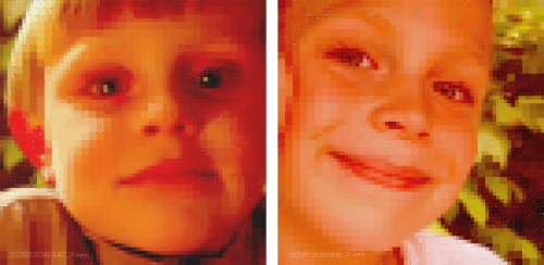
H&T "Not So Close"
I did these two images last week, in what was my first week without scheduled (professional) work in perhaps a year. I took one official “vacation” week off in June, but have been working straight through pretty much ever since. This was the first chance to relax that I’ve had in a while. As an architectural illustrator, I’m very lucky to have work in this economy.
These were executed digitally, in Photoshop. I currently work on a 21″ Wacom pressure-sensitive monitor, which lays flat and allows me to paint or draw directly on the screen. I used a small 4×6 Wacom stylus pad, off to the side, for years. But it always felt like a disembodied pen. This is much more analogous to working on paper directly.

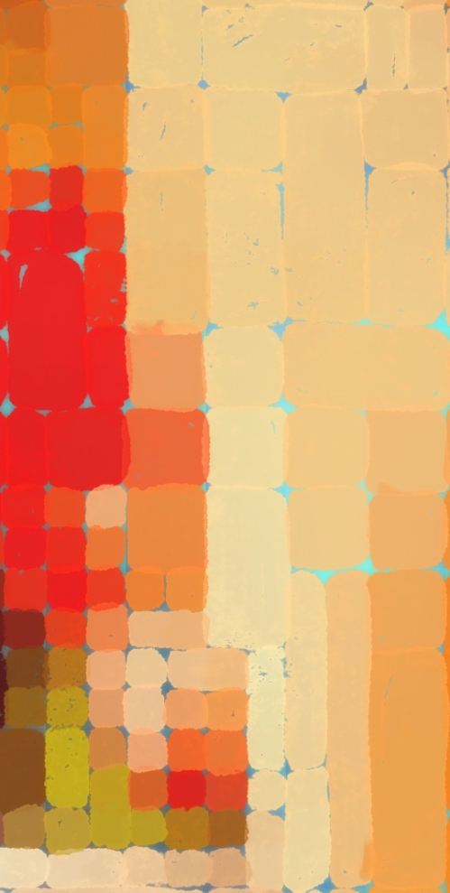
T_detail at Full Size
At any rate, these are obviously Chuck-Close-inspired pieces. I didn’t want to copy his approach, but rather wanted to do something very simple with the images, to break them down while preserving as much information as possible.
The originals are 23×23, 150 dpi. Medium-res. The squarish blobs of paint are done in two sizes, with the smaller size reserved for areas of detail. Still, the iris of the eyes is only four or six squares itself. Not much detail. And yet at a distance of say 10 feet away, the eye (and brain, of course) pull them together pretty well. I happen to enjoy them closer in, when the edges and overlap of the paint can be seen, and the complementary blue ground underneath the oranges is allowed to poke through the gaps. The battle of the blues and oranges is enough to create some tension in the ol’ visual cortex… But conversely it also has the benefit of graying down the saturated colors. Without the sprinkle of blue in there to hold them back, the oranges would be even more “through the roof”. A very interesting thing though is that the human eye “digests” color in a few ways, and it does each process separately. When it’s figured the scene out, it puts the infformation back together and you “see” things. What’s odd is that if I made a desaturated (no color, a greyscale) version of this, most of the blue would be the same shade of grey as the orange it sits next to. They have the same value, despite the fact that sometimes one or the other looks brighter or darker because the colors are so different. They are “isoluminant”. I made their shading levels equal (equal value), so the shading is correct regardless of color. But since the colors are nearly exact opposites, the brain also perceives a conflict. One part of your visual cortex tells you they are vastly different. The other tells you they are very similar. …and that’s where the tension comes in.
T at 96dpi_6x6
I opened a couple photos that I’d taken of the boys and then dragged them into Photoshop. My son, “T”, (above) was sitting in front of the fire place, and his coloring drove the palette for both images. I adjusted it quite a bit to narrow the range and clamp down on the high and low exposure, then worked on adjusting the right image of “H” to match the same rough color range. His photograph was taken outside in indirect daylight. Being indirectly lit outdoors, he had a blue cast, and not a lot of contrast. I tweaked his levels a bit too, and adjusted the overall color balance to make the images more of a matched pair.
H at 96dpi_6x6
After painting in the blocks of paint, I merged all the Photoshop layers and then pasted the image on a new layer under itself . Inverting the colors of the work gave me the exact complementary colors underneath the oranges. I blurred them a bit to expand them and to allow them to break through the negative space between the orange blocks above. Had to kill some of the over-bright blue, and jack up the bits that were too-dark. Still, it gave the oranges something to play against.

The detail above is just under full size. The bigger squares are really about a half inch. And yet I think I could have gone even blockier and been more aggressive in breaking down the images. They still read remarkably photo-real at anything over five feet away. I really was going for something messier. Next time.
So. First post. I do have a website where I update things fairly regularly, but this format will allow me to expand a bit more on the work. The website is a bit of a flash portfolio, for clients. Hopefully here I can explain things a bit more, and maybe cast a wider net too.
My business is architectural illustration. These pieces are of course outside that narrow field. I’ll be adding some old and new work here every now and then, irregularly, both professional and self-indulgent. We’ll see how it goes.
