Tag Archives: digital paint

2013 Year End Review

This year I executed just under a hundred images, in levels of detail varying from sketchy to formal.  There were a large number of pencil images, split about evenly with fully digital pieces, and one simple watercolor sketch done as a gift for an architect’s client.  …a pretty busy year, in all.

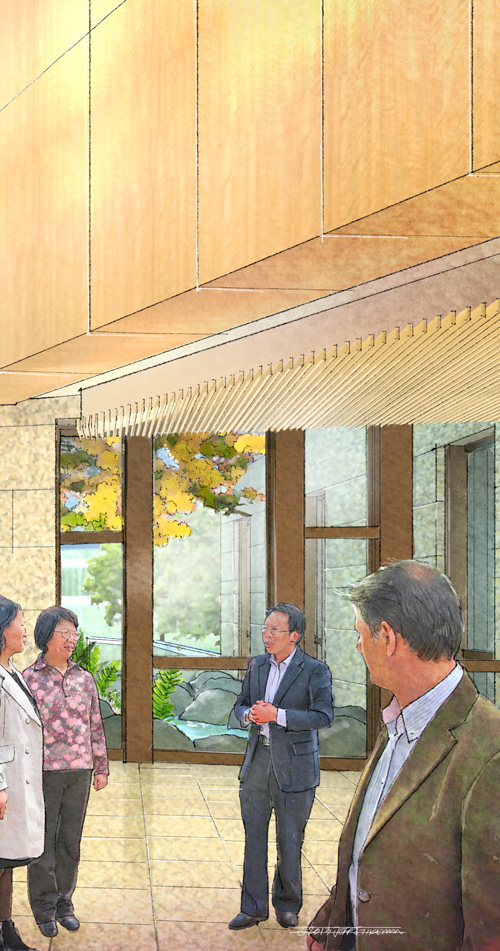
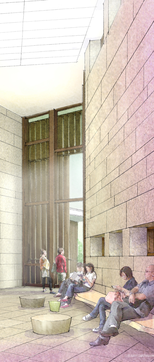
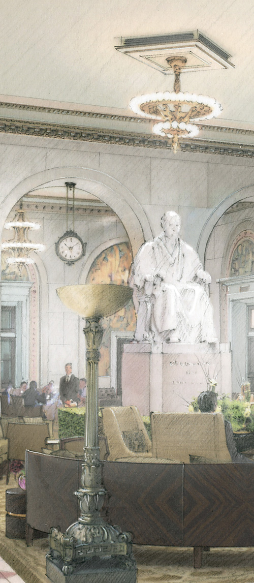
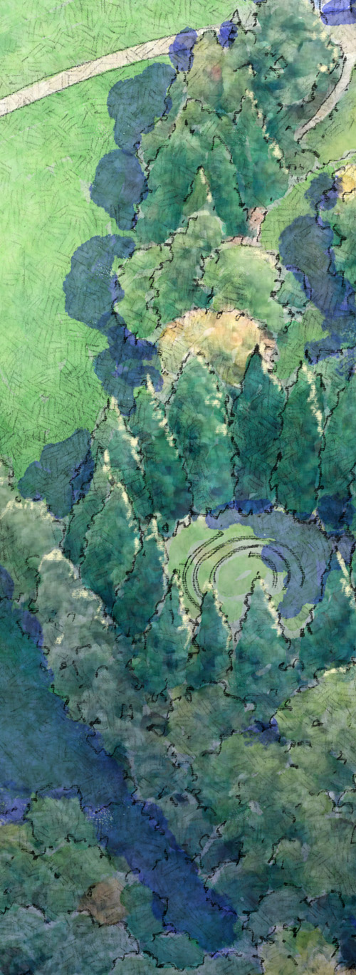
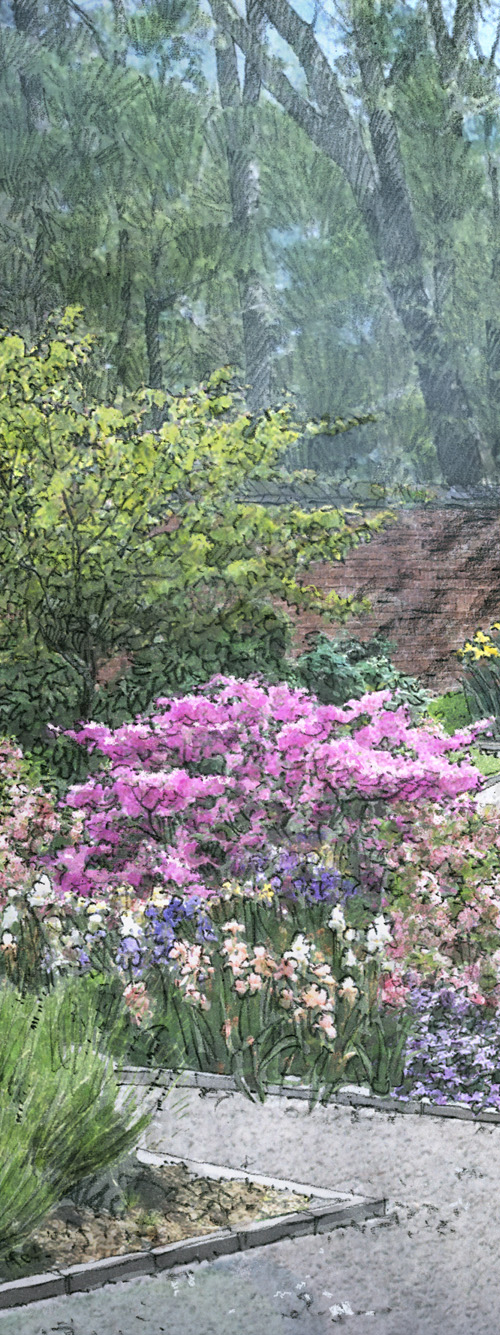
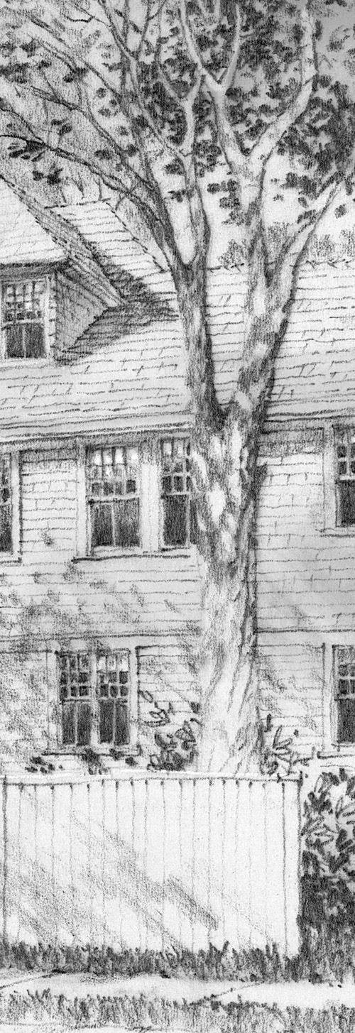
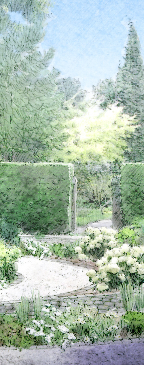
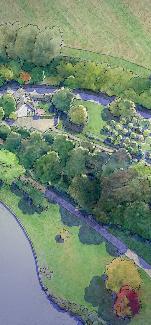
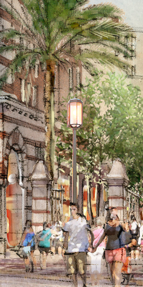
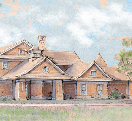
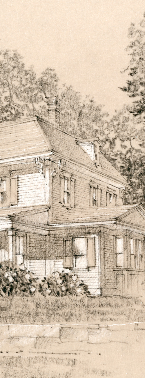
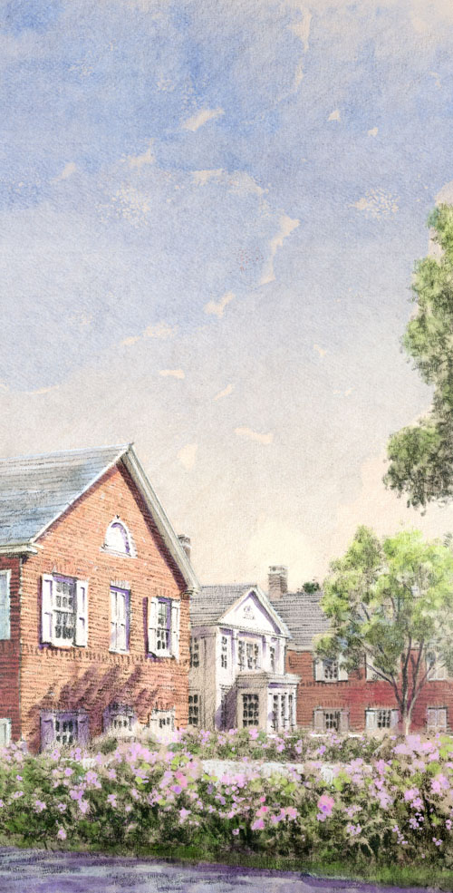
Following are some details from a little fewer than half the images.  There’s no real text here, as I’ll just let the work speak for itself.  I cannot thank my clients enough, and thank you too for your interest in my work.

01

02

03

04

05

06

07

08

10

11

12


14

15

16

17

18

19

20

21

22a

23

24

25

26

27

28

29

30

31

32

33

34

35

36

37

38

39

40

41

42

43

44

45

Happy New Year.  See you in 2014…

– Jeff Stikeman

3 Comments

Filed under Commissioned Work

Recent Work: Summer 2013

Been a while….  The year has been ridiculously busy, thankfully.  Haven’t really had much downtime, and believe it or not, other than a semi-slow July/August (three or four projects each month), I have been working straight through on a variety of projects large and small.

Development work (retail and residential) is coming back in force as the rising tide of the economy continues.  Although there was always some level of private residential work being done through the recession, it seems to really be taking off again. In short, things have been busier than ever.  Still no excuse for nearly a ten month delay in updating the blog.

I’ve been privileged to work on some fantastic projects, including about 18 or so renderings for the U.S. State department, on a couple different jobs.  Sadly, most of it is confidential, as is much of the institutional and development work which has kept me busy over the year.

Best I can offer at this point is some cropped enlarged details from some of the work, uncredited and with some details obscured.  The drawings range from sketchy concept work, to more formal, finished renderings.

Apologies for withholding project information.

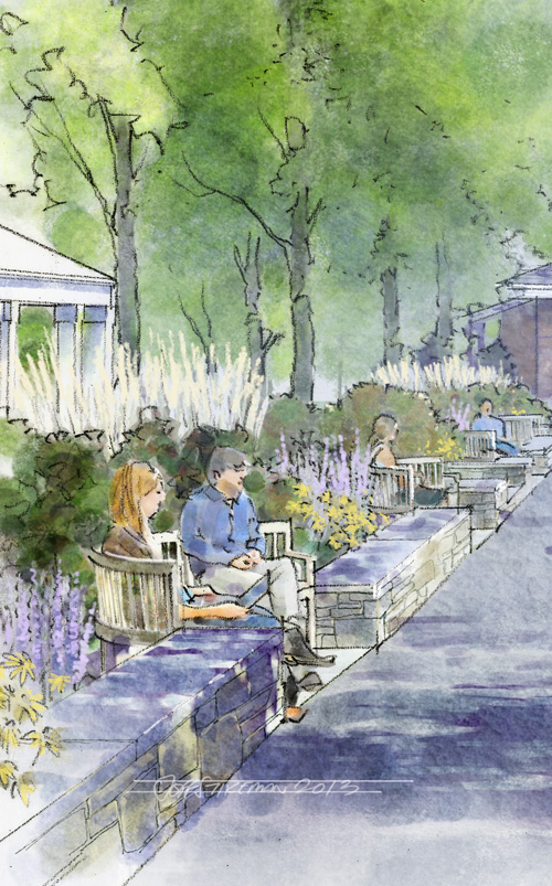
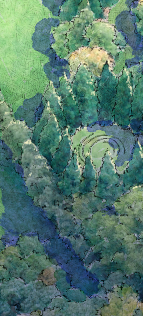
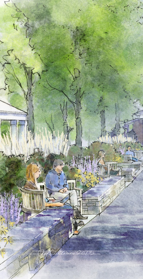
These are details (about 2 inches x 6 inches) of some 11×17 sketches I did for a study of a landscaping master plan for a large property.

Untitled-2

aerial

aerial2

Untitled-3

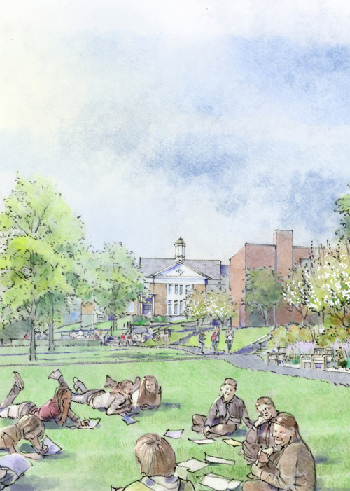
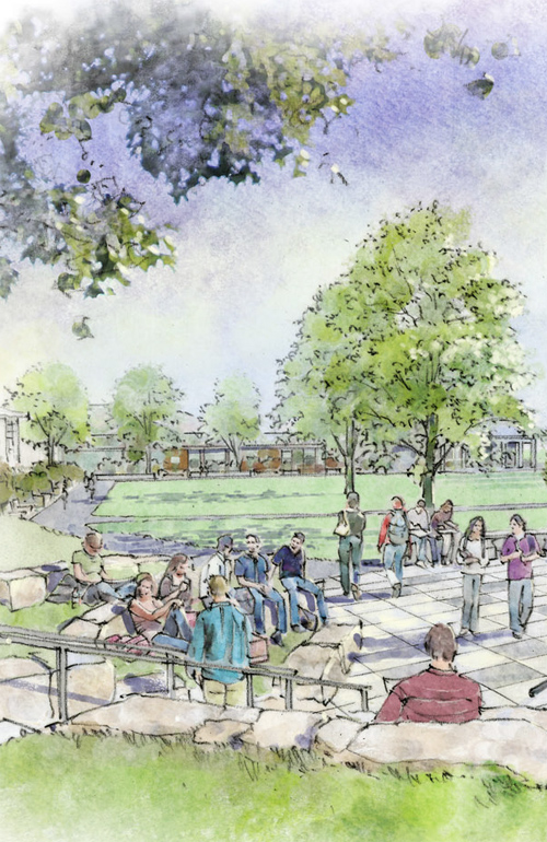
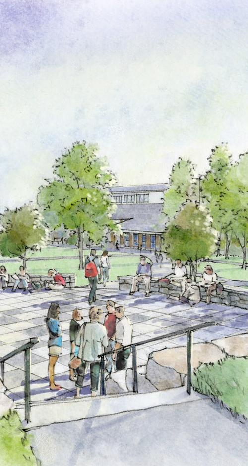
Some sketches done in a looser style, for a private academy, as part of a masterplan study.  These are loose enough to turn around in just a few days, even a half dozen of them. These types of softer sketchier preliminary images connect with trustees, staff, students, and lay people (and donors!) far more than a screen-shot of a sketch-up model can, and can be pretty cost-effective.

Untitled-1

Untitled-2

Untitled-3

Untitled-4

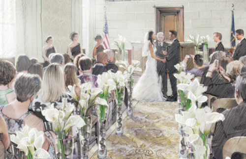
Lifestyle and hospitality work is back in force as well.  I did a small series of very atmospheric, highly considered images for a proposal at an historic property.  Again, I can’t really provide any details, or show most of the work, but here’s a non-architectural detail, one that’s all about the entourage (the people and supporting elements in the image).

wedding

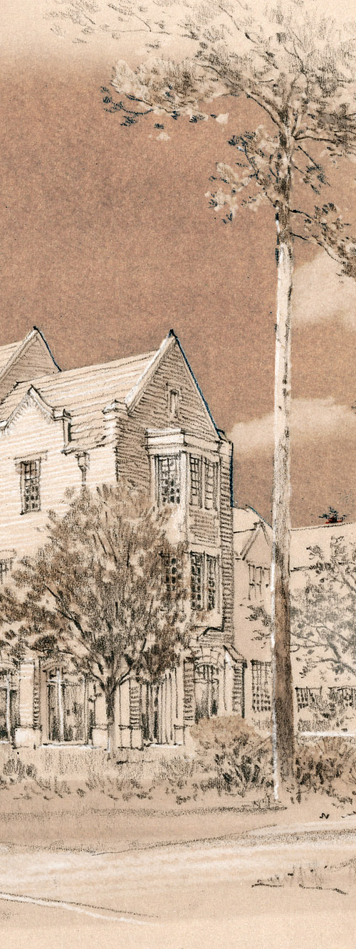
Here are some greatly enlarged details from loose studies done as part of a retail project.  They were done on warm buff paper, with pencil and white highlights, digital color added.

retail-study02

Untitled-12

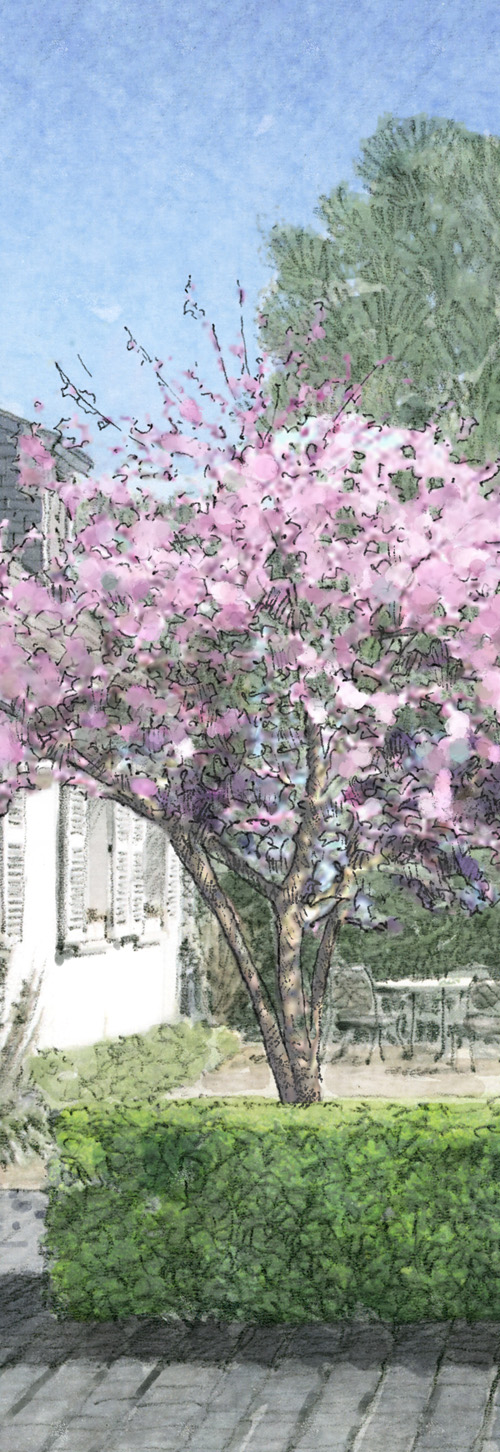
Residential work lately has focused on preliminary studies, early concepts… Architects are finding that in a competitive environment, it’s always good to be expressive as early in the process as possible.  Loose flexible sketches can be done the day before (or even day-of) a meeting, and again, clients respond more positively to them than they do to screenshots of an antiseptic sketch-up model…  Sketches like these can help make decisions, move projects forward,  and provide something for the client to become excited about, invested in emotionally. These are cropped details.

house01_revised

house02_revised

sketch

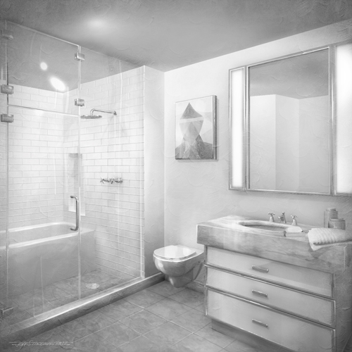
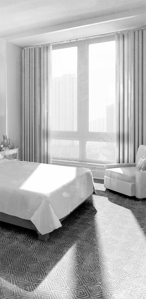
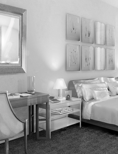
Although much of the work has some amount of color, there are times when monochromatic studies can be effective.  The intent here was for atmospheric, painterly, loose-yet-detailed images.  From a series of about eight semi-formals, these are digital, and were done from a roughly built model.

BATH

BED-1

BED-2

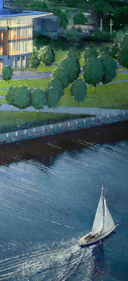
Here’s a small detail from a large aerial I did of a proposed University expansion.  It was 22 inches wide, at about 400 dpi. …fairly large by today’s standards.

aerial

aerial2

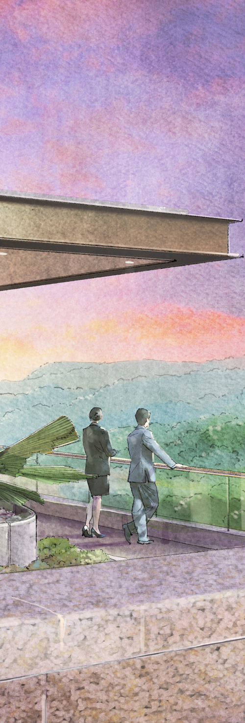
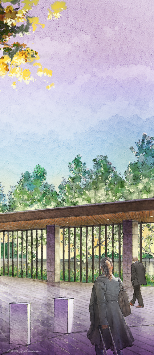
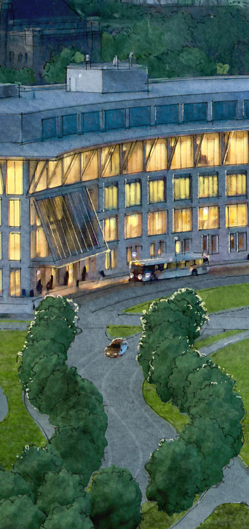
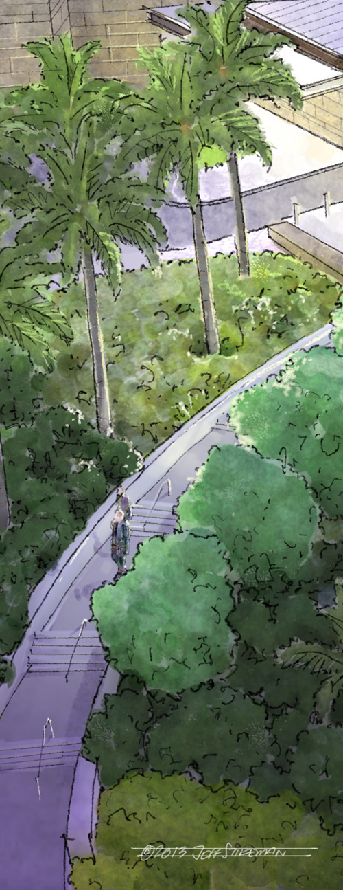
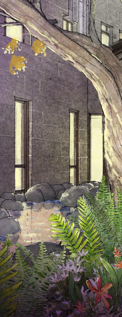
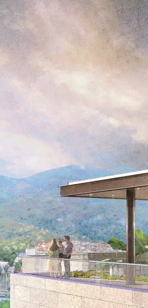
March saw about a month’s worth of time given over to executing 12 formal images depicting a modern building proposed for a semi-tropical location.  Much attention was given to the highly developed landscape and exterior lighting plan, and in hewing closely to the existing context and local environment. These details are about an inch or two wide in the originals, which were 12×16, 300dpi.

aerial-1

aerial-2

eyelevel-1

eyelevel-2

eyelevel-3

Thanks for taking a look.  I hope that the wide range of images here, from sketchy to atmospherically formal, will give an indication of the rendering options available at any point in a project’s life.  There’s always a cost-effective solution, and one that almost always works with the schedule.

2 Comments

Filed under Commissioned Work

Refurbishing a Boston Landmark

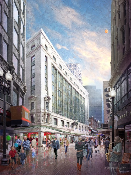
Very quick sketch here from a few photographs of an existing building, the old Filene’s Department Store, by Daniel Burnham, 1912.

digital photoshop sketch  of Filene's Boston by Jeff Stikeman Architectural Art

Filene’s Boston, 1912, by Daniel H. Burnham Architect, of Chicago. An Idealized Sketch of the Building Following a Proposed Future Refurbishment (click for a larger version)

Downtown Crossing, Boston, is a hot topic at the moment, and most of the discussion revolves around the proposed development of the Filene’s Site, of which this building is a part.  I worked on the Filene’s project/site about fifteen years ago, on the opposite side of the block backing up to the Burnham building. The mid-50s Brutalist Concrete building (since demolished) by Raymond Loewy,  was being considered for expansion and a ‘facade-ectomy’.  Nothing came of it (the project succumbed to the recession of the early ’90s).  That project however also included some measures for restoring the existing Burnham Building, cleaning and stabilizing its granite field, and deep-green glazed terracotta columns. The full restoration did not take place at that time, but there were measures taken to stabilize the terracotta, and replace some that had been lost or excessively damaged.  Those pieces now read in a different shade of green, having weathered the couple decades not as well as the century old glazed terracotta of the original. As part of the comprehensive development of the site (including a high-rise tower), some amount of work will need to be visited upon the flagship building.  Additionally, the window glazing which has been painted out for many years is shown here as reopened, allowing us to see into the building a bit. In this daytime view, we see only a few hints of the light fixtures at the ceiling level, but there would be a visual connection between inside and out. In the evening, the interior would be illuminated and warm, rather than blank and dark as is has been for decades.

Enlarged Detail of a proposed Corner Retail Entry and Glass Canopy, for the Original Filene’s Building at Downtown Crossing.

This image is only one concept, and will certainly be supplanted by further studies to be sure.  But in this exercise, the charge was to show the building facade refreshed, the ground floor as reopened, with a corner retail entry, new glass canopy, an entrance to the T, and perhaps a hint of an office entry mid-block, just past the T entrance. The view is Idealized, too. It’s not entirely possible to see wthis much of it from the location I’ve sketched it from.  But more about experience than specifics. I wanted you to understand the building, the intersection, the crowd, and the experience of stepping from narrow Winter Street into the light and under that great facade.

The crowd at downtown crossing is an interesting mix of office workers, tourists, young students, and residents. They are what give the area its energy.

A Detail showing a proposed entrance to the T (Subway) on Summer Street beyond. The lunchtime crowd depicted here reflects the energy one can expect to find at Downtown Crossing on a typical day.

As with most concepts, none of this is cast in stone.  That’s the challenge with a sketch like this. We need to represent what actually exists, couple it with what might exist, be specific about it without being too specific (because it isn’t resolved yet), and communicate some idea of the nature of the place.  Downtown Crossing is a vitally energetic part of the city, a literal and figurative crossing (hence its name). And for the last hundred years, a grande dame, the Filene’s building, has been holding court.  She’s a little tired after all that time, but with a bit of attention will again be a beautiful backdrop to the hurrying, shopping, ever-changing never-changing crowds below. That was the idea behind this illustration.

I’d posted this detail out of context a while ago. It’s clear now we’re looking at a touristy dad with kids in tow. His daughter has lost a balloon.

…here it is, diagonally across the frame, heading up, and soon to be lost around the corner of the building at right.

A last detail… There’s always the sound of music somewhere at Downtown Crossing. A sax player, drummers, a guitarist…. often overlapping, always echoing as you walk through the narrow streets on the brick paved streets  among the buildings.

I worked from an existing photograph, which is entirely typical when the subject is extant. No sense reinventing the wheel.  The deadline was also about a day of working time, with some good amount of conversation with my client beforehand, and some minor editing after. The work was performed in February of 2012. Joseph Larkin, of Millennium Partners, was the client.

The photograph which was used as a basis for the above work.

1 Comment

Filed under Commissioned Work

Park Plaza Boston: Roof Top Bar

I showed a couple small details of these back in June, but can now show them in their entirety.

In June I received a call from Robin Brown, with whom I worked on the Mandarin Oriental Hotel, of Boston.  I was the senior designer of that project while at CBT Childs Bertman Tseckares Inc., architects.  In fact, it was perhaps the last building built of those that I designed before I left architecture and started my illustration studio. As with many projects, what I designed, and what was built, had a divergence.  But enough of it is still there of my work that I count it among my projects.  Here’s an very old study I did for the Mandarin, during the public approvals process, ca.2001.

Entry Study for the Mandarin Oriental Hotel, Boston …one of my first experiments with photoshop. Can you tell that I had discovered the ‘gradient’ tool?

While working on it, I got a comment from someone that computers were really amazing, because otherwise it would have been impossible to figure out the shadow from that arching glass canopy.  …I wasn’t very successful at explaining to them that it was 2d, not a model, and that Photoshop did not ‘calculate’ anything related to shadows, but I did.

Anyway, back to the subject at hand. Robin had been investigating the idea of developing a roof top deck and bar at the Park Plaza Hotel.  It’s an enviable location, with roof-top views of the Public Garden, the Arlington Street Church, Old and new John Hancock Towers….

Today, the roof is a mix of rooftop equipment and high parapets.

Existing Condition of the Roof Top, with extensive HVAC components, and tall parapets

I walked through the interior space, and outside along the roof top, with Eric Peterson of Symmes Maini & McKee Associates of Cambridge.  They and design architects Arquitectonica are studying the feasibility of the concept. There were, at the time, only rough indications from their model of a furnishing plan for tables, and defining the extent of the roof deck.

A quick model shot provided by the architects, showing approximate extent of the roof deck.

There was not much else available to work from at that point. “Just see what you can come up with.” Robin wanted something that would speak to the energy level of the project, that captured the fantastic location, and which maybe conveyed what it would be like to be under the sky at night in the middle of Boston with such a vantage point.
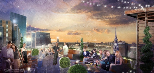
digital photoshop illustration of a roof deck for the Park Plaza Roof, Boston

Looking West, down St. James Street, from a Proposed Roof top Bar at the Park Plaza Hotel

Sometimes, with an existing space, you can grab a few well-considered shots and simply sketch right over them quickly.  And Robin needed these quickly (day and a half, two days max.).  But this time it looked like a tall order to grab a few photos and just sketch away.  And we wanted the finals sketches to be taken at night, too. I took a few panorama photographs, doctored them a bit, removed the equipment, and painted away.

Looking North, over the Public Garden, Boston. Zakim Bridge at upper left, and the Dome of the State House middle right. Proposed tensile structure and bar at right, beyond.

These suffer from the restrictions of a blog, only 550 pixels wide.  In reality, they are about 12×18 and 300 dpi.  And so, some details.

Looking West, down St. James Street, with the old and new Hancock Towers at left

Instead of four-top tables, I went with groups of upscale seating, sofas, low coffee tables, and plantings of boxwoods and cedars in zinc planters. The deck is shown as Ipe or Teak.

Another Detail, Looking West, with the old New England Mutual Life Insurance Company beyond.

Necessarily, there isn’t a lot of ‘there’ there.  Just messy indications and highlights, more sketchy than specific.  Here’s a shot enlarged to the point where it falls apart.  The idea isn’t to zoom in and see detail, it’s to imply detail when zoomed out.

An enlarged detail, past full size. Really nothing here beyond a few strokes and indications of color and highlights. My favorite is her apple-tini.  Nothing there but a green triangle and three highlights.

Here are a few details from the view looking north.

The idea was to place groups of seating which defined an area for small groups of people, with enough open area beyond for a small function or cocktail reception. Note the State House beyond.

The parapets of the existing condition were chest high. Assuming the deck was built to be elevated about much of the existing piping, it became clear that the parapets could be brought to below eye-level, vastly improving the view. Instead of looking into a brick parapet, you’d be overlooking the Public Garden.  I introduced a continuous boxwood hedge and glass rail, lit from below, with the seating in front of that. This kept us back from the parapet, reducing any potential vertigo (we don’t want anyone looking over to the street below) and gave a better sense of enclosure while still preserving the view.

Numerous seating configurations scale the roof top down to more intimately sized areas, a glass rail preserves the view, and is set back from the parapet by a low boxwood hedge, lit from below. The Zakim bridge is beyond, left.

An existing penthouse of brick is to remain, and will contain the elevator lobby, bar, and service areas.  The industrial nature of the older original equipment will be cleaned and restored, left in place, with perhaps a tensile structure appended in a way that covers the doors out onto the roof terrace.

An existing Penthouse will remain (at right) with a new tensile structure expressing the connection out to the roof terrace.  And no,  That’s not Tom Brady….

What I enjoy about being able to share these in greater depth on a blog, is that I can explain how they are developed, and convey what the REAL effort can often be.  It’s not enough to simply paint a picture of something from information provided.  It’s sometimes more about synthesizing many things: incomplete designs; verbal descriptions; and quirky design complications; and delivering something which expresses the designers’ and the clients’ ultimate intent and which speaks to the big idea.

All work was done in Photoshop CS5, about 12×18, 300dpi.

copyright © jeff stikeman architectural art 2012

Leave a comment

Filed under Commissioned Work

New Work: March-June 2012

Well, I thought February was busy….

Haven’t really had any time to update, which is the very thing that will end up killing a blog.  Literally haven’t had a day off since February began.  That’s both good and bad, obviously.  Nature of the business is that you take work as it comes.  I’m looking for a little break during the typical summer slow-down. And I do have a week of planned vacation coming up.  …can’t believe the year is almost half over. But I could use a break.

Again, most of the work has been confidential.  Most projects coming out of a recession are of course start-up.  Not doing many marketing renderings (for finished/built work), instead, it’s mostly concept work, or schematic design level work.

I did execute a couple more formal images for Powers/Schram of Fort Lauderdale, of a mid-century modernist waterfront home.  I worked with Rick Powers a couple times when he was here in Boston as an architect at Tsoi Kobus, and it was nice to reconnect and work with him again.

Street View of “Sunrise Key”, Fort Lauderdale; digital paint with pencil, 11×17

View from the Water of of “Sunrise Key”, Fort Lauderdale; digital paint with pencil, 11×17

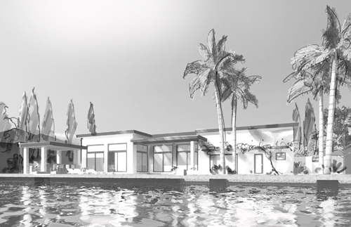
Before executing the two images above, we studied a few black and white camera tests.  These two are my favorites from among those we discarded.

Camera Test, for Sunrise Key, Water Side

Camera test, Street Side

I was partial to the lower camera station of the camera test from the water-side, but the intricate and rich landscaping plan begged for a higher camera angle, and it was decided to raise the camera to a point where the pool and landscape could be more clearly seen.

Some details of the final version of the Water Side view, at near-full resolution:

And details of the Street View:

As has become a recurring refrain here, most of the work I’ve done the past few months is confidential.  Following, though, are some details from work which I’m allowed to share, though many are necessarily cropped to remove any telling information.

11×17 Pencil Rendering

Detail of same

…a portion from a very quick, chalky/gouachy little sketch, about 11×17

A detail from the same sketch

A detail from a 9×14 pencil sketch, flicked with digital hi-lites and paint, on brown kraft-paper.

…another chunk from the same sketch, a private home, in Newport Rhode Island

A tightly cropped detail from a very quick, very loose digital sketch, for a proposed roof deck bar. This detail only about 2×2 from an 11×19 sketch

A detail from the second sketch in this pair of fairly loose, sketchy digital pieces.

In looking back at these, it strikes me that each image is entirely different than the next.  Rather than all pencil, or all digital, there is (I think) a healthy mix of differing approaches to the issue at hand.  Rather than reflecting what works for me, I think it better illustrates that my work is about answering the client’s need.  What do you need, when do you need it, and what do you have for me to work from?  And most important; who is your audience?  These are the questions which, for me anyway, determine what kind of image we end up with, how long it takes, what the final piece feels like…

I’ll try to be a bit better about timely updates.  With the economy the way it has been, there’s a tendency to keep working, never sure when the shoe might drop.  If the work keeps coming in though, that can make for a long run of heads-down work. All work and no-play, and all that.  We shall see what summer holds.  Since it seems to be when my clients, and their clients, take their vacations, that means it’s generally my vacation too.  Have a good summer yourself.

1 Comment

Filed under Commissioned Work