Back in October I worked with Lance Ferson and Paul King of EYP, out of their Albany, New York office, to produce four images for the new US Embassy in Oslo, just outside of the city in Huseby.

View of the Main Entry Pavilion, US Embassy, Oslo, Norway; 11x17 300dpi ©2009.jeff.stikeman.architectural.art
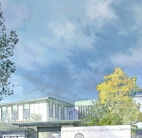
For me, the personal challenge in these images was to capture the quality of light and the nature of the site and so, before slapping any paint, I spent some time studying photographs of the area, just outside Oslo, as well as photographs of the Norwegian landscape and the quality of the light. This gave me understanding enough to begin to establish some sense of place. Particularly important were the lower angle sun of the northern latitude, a good bit of atmospheric lighting (bounced light, light from the environment and not just the sun) and including the types of trees, flowers, and indigenous wildflowers that we could expect. An in-depth landscaping design was prepared by Carol Johnson Associates, which addressed hardscapes, the types of new trees to be planted, which of the existing trees would remain, and how grassy meadow areas and an existing wet area (the riparian way) would be handled.The quality of the lighting was my principal concern. About half of it came from setting up things a certain way in Cinema 4D (a digital modeling application), and the other half was handled in paint (Photoshop, actually). Trees, wildflowers, and the sky are meant to introduce a character and a sense of place.

Detail; Skies are always difficult... The sky made for nearly half the image, but needed to remain secondary to the building and grounds of the Embassy while simultaneously having enough visual interest in color and texture to hold its own ©2009.jeff.stikeman.architectural.art
I wanted to establish depth (the site is settled into a fairly rustic surroundings), and so played up the atmospheric perspective. Normally farther objects take on a bluish hue as the atmosphere builds up between the viewer and the background, but in this case, and because the image was meant to be taken in late morning, I went with a warmer approach to the background.

I tried to give the image some depth with a bright foreground of wildflowers and meadow grasses, darker middle ground of cooler blues and purples, and then a bright background again of warmer less-saturated warmer hues. ©2009.jeff.stikeman.architectural.art
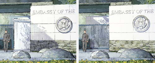
I think there was only really one edit to this image in the end. I had mistakenly understood the “gate” to be literally a swinging gate, and spent a fair chunk of time making the shadow from the open gate fall across the embassy sign in a way that was visually interesting. I also teased the sun around enough to get some tree shadow falling on the gate itself, to keep it from being monolithic.

On the left, the image as originally delivered, showing my interpretation of the open, swinging gate. At right, the correct configuration. ©2009.jeff.stikeman.architectural.art
The edits were effected entirely in Photoshop. Removing the open swinging gate (in reality, the gate slides behind the embassy sign) is simple enough. But spot edits often require some additional and pretty esoteric stuff be done in order to be tied into the image fully. For example, notice that the gate and its shadow don’t simply need to be scrubbed out, but the embassy seal is now lit differently, picking up bounced light from the pavement; the linework of the stone panels is also hit with more light; and the overhang and seal of the courtyard beyond are now visible.
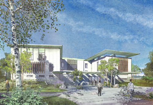
In the second image, the Chancery sits on an intimate arrival courtyard, encountered after passing through the Entry Pavilion building.

A view of the Chancery from within the Entry Court; 11x17 300dpi ©2009.jeff.stikeman.architectural.art
Paper and river birches of varying maturity are sprinkled throughout these views. I’ve idealized them some, and may have taken some minor liberties with the season. Ideally, the intent is to show them as they leaf-out in the late spring, some varieties a little further along and deeper green.

Detail of the Chancery View, showing the Seal of the Embassy tucked under the deep, perforated copper porte cochere. ©2009.jeff.stikeman.architectural.art
The approach here was to use the hardscape (granite slab) of the courtyard to introduce substantial amounts of bounced light back into the shadows. This allows me to establish darker shadows at their outer edges (which ‘pops’ the geometry of the forms) while taking the edge off what would otherwise be a sea of darkness by lightening the interior of the shadow. Nothing new here. It’s an age-old visual trick, but it has a basis in reality. Shadows often appear much darker at their edges because our eyes are picking up the contrast of the shadow and the bright sunlit surface outside the shadow. If this is sufficiently bright, the iris constricts, and the perceived contrast goes up. We see the edge as very dark because the lit wall is very bright. Looking deeper into the shadow, our iris relaxes and opens to let in more light. Literally, our brain interprets the deeper part of the shadow as less dark. Graphically establishing the shadows with both devices at once heightens the effect. The perceived sense of shadow darkness makes the sun feel “brighter”, while simultaneously allowing light back (even additional colors) into the image. The shadows can actually be kept fairly light, and that keeps the image itself from getting too dark, especially when printed.

Detail of a tree shadow as it falls on the building and across a large window ©2009.jeff.stikeman.architectural.art
This is a more exaggerated example. Notice the edges of the tree shadow are handled darker with a cool purple, and the interior is a warmer and much lighter magenta. The idea (whether it works or not is up to the viewer) is that the dark purple establishes the shadow, and the lighter center eases off a bit, and introduces some warmth to counter the cools. The purple shadow falls on a warm yellow stone, and since the two (purple and yellow) are complements, the intent is that hopefully they work together to take each other down a notch. The purple seems a little less purple than it otherwise might.
Just to beat the idea of bounced light to death… The underside of the copper overhang here is re-lit by some bluish atmospheric light and warm light from the pavers below. This is an exaggeration as well, but in truth, bounced light is often blue. The sky itself is a light source independent of the sun. Of course, the sky gets its light originally from the sun, but ultimately that light becomes blueish in cast after bouncing around and becoming diffused by the atmosphere. The sky’s light is omnidirectional, too, and will often fill in the underside of broad overhangs, or deeply shadowed areas.
On the other side of the chancery, in the middle of the site, there is an existing wet area. A small existing stream flows from the rear of the image down towards the viewer and off to the right out of the frame. A mix of grasses, wildflowers, and wet-loving trees will be maintained and preserved, and further augmented with new indigenous plantings.
Here’s a little more of that bounced lighting I have been yammering on and on about, under the overhang and in the light magentas of the stone wall near the windows (at middle right). The bright building corner (at right) meets the shade side of the building, establishing the corner. But the darkness of the shade immediately eases off as we retreat into the far corner, keeping this portion of the image from being too dark and colorless.
You’d never know that this scene started out with four buildings visible to the camera. To the architects’ credit, there was never a real issue with obscuring the architecture. For them, and the landscape architect, the riparian way was as much a part of the concept as the buildings, and as important and potentially powerful, visually. It was with some (though minimal) hesitation, that I started painting in trees enough to almost obliterate the architecture. We slid one or two around, but for the most part, these trees represent existing or proposed locations in varying levels of maturity. Depth was an important thing to preserve in this image, and was accomplished again with less saturated greens and shadows in the deeper parts of the image, and less detail.

Walkway to the Marine Residence, along the riparian way, detail about 2x2 ©2009.jeff.stikeman.architectural.art
The last image was from the North, showing a view of the Chancery from a roadway which it shares with a residential neighborhood.
A north view can often be a challenge. Frankly, though it is among the simpler of the image compositions, this was the image which took the most time to execute. North-lit facades are in shade, and are lit entirely by the sky. Sure, I could have decided to base this image on the morning of the summer solstice, when it would be picking up idyllic morning sunlight, but that would be a little too obvious. I decided to keep the time of day pretty much the same in all the images. In this case, the sun is at deep left, shining on the eastern façade. another difficult compositional element was the security fence. The fence is made from very narrow square pickets, closely spaced. While moving, even walking, the fence becomes nearly invisible. Taken in a static view, it could be far more impactful than it really would be in experience. In an interesting way, being lit the way it is keeps the fence from graphically becoming overly dominant. If it were lit from the front, it would go bright, and become significant. Here, backlit, it falls into the middle ground values of the meadow beyond.

Detail of the image from the right side, at the western end of the north facade ©2009.jeff.stikeman.architectural.art

Detail of the Chancery Building. The window in this detail offered a way to introduce some lighter values, simply because the glass would be fairly reflective at this angle and could show us the sky behind us, over our right shoulder. ©2009.jeff.stikeman.architectural.art
The model for this project was developed by EYP in Revit, and though we wrestled with it a number of ways, we eventually found a workable solution for bringing it into Cinema 4D, where it was lit and rendered. All linework and color was performed in Photoshop, on a Wacom 21-inch pressure sensitive monitor.
© Jeff Stikeman and jeff stikeman architectural art, 2009. Unauthorized use and/or duplication of this material without the expressed and written permission from this blog’s author and/or owner is strictly prohibited. Excerpts and links may be used, provided that full and clear credit is given to Jeff Stikeman and jeff stikeman architectural art, and only along with appropriate and specific direction (link) to the original content here.


