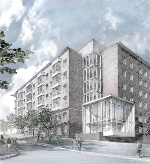
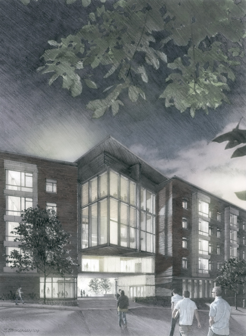
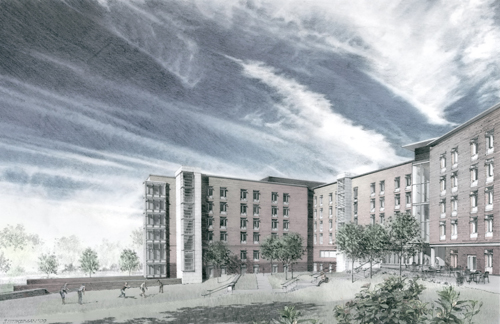
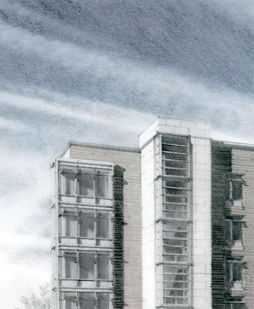
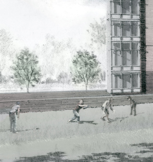
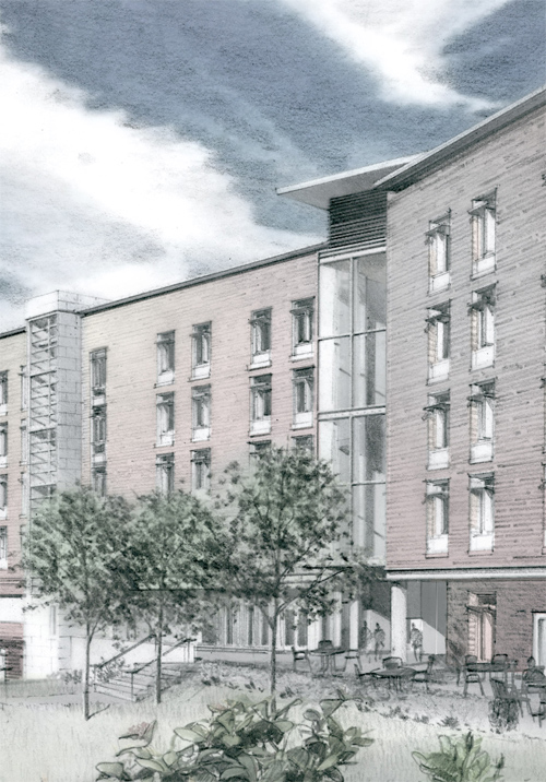
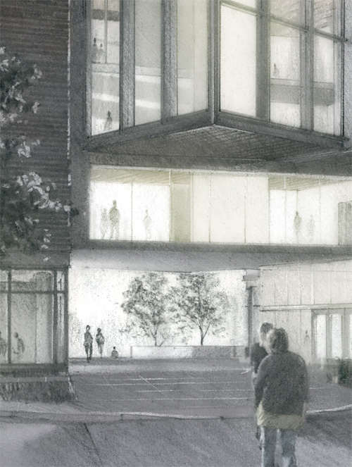
Did a pair of fairly detailed pencil architectural illustrations this past weekend for a dormitory currently in the schematic design phase. We had initially thought there might be four, but decided to do two more-finished pieces instead of four more sketchy ones.

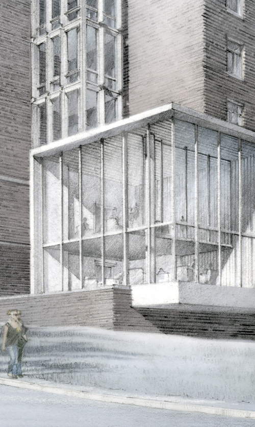
Building Entrance, from the North, Evening View

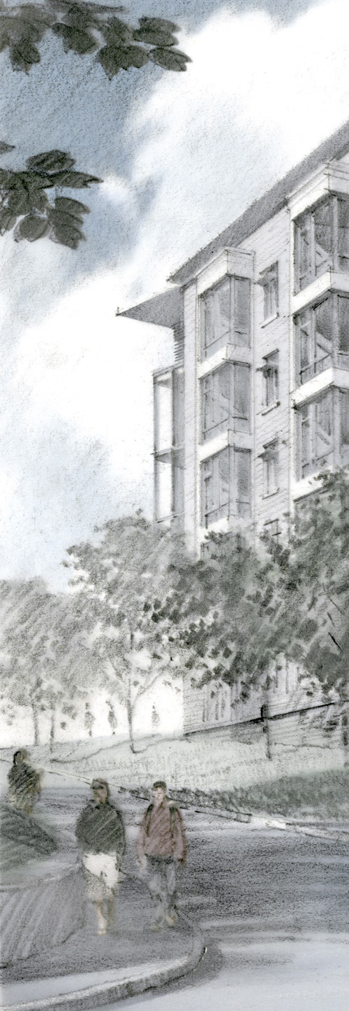
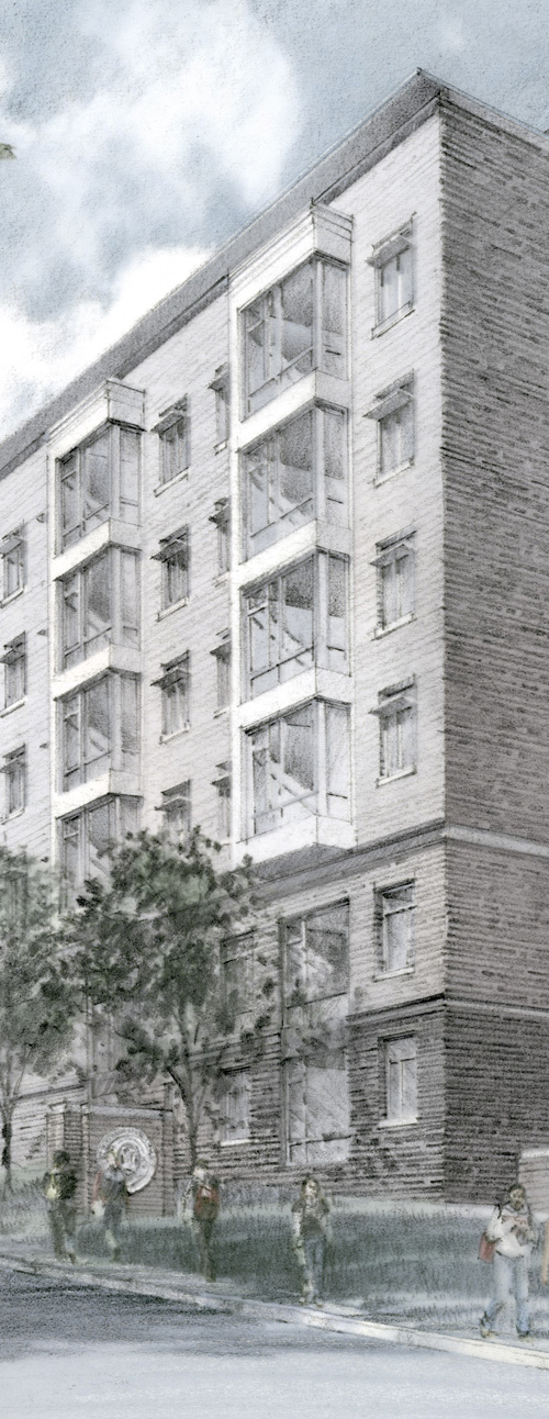
View from the South, overlooking the Lawn

You should see 33 divisions in the grayscale bar above. If you are seeing solid black, or all white at either end, you should adjust your screen's brightness/contrast setting, or the pencil images on this website will not display as they were intended.
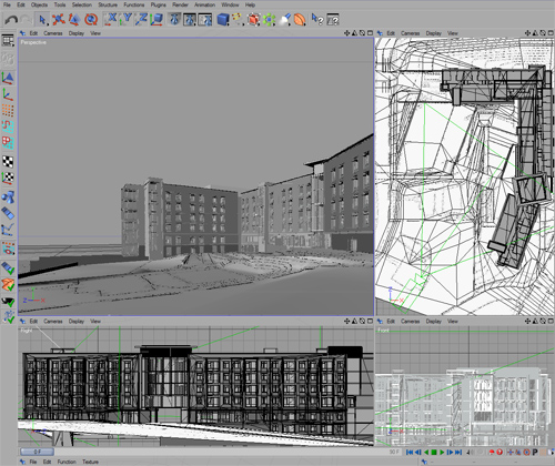
Working with Preston Richardson of Pfeufer Richardson Architects and Paul King of Einhorn Yaffee Prescott, I spent a day or so putting together some camera tests and lighting a model provided by David Foxe and Desmond Macauley of EYP. Desmond is the Senior Designer on the project, and was developing some details at the same time I was beginning my work. There were some elevation iterations being played with, which didn’t really settle out until I was halfway through the pencil work, so the model served mainly as a wireframe and as a source for some lighting and shadow information, used later to add a little more depth to the straight-pencil work.

Screenshot of the Model in Cinema4d
The daytime shot (screenshot above) was simple enough. I basically referenced the shadows from the computer model, and used a render test as an underlay to develop the pencil work.
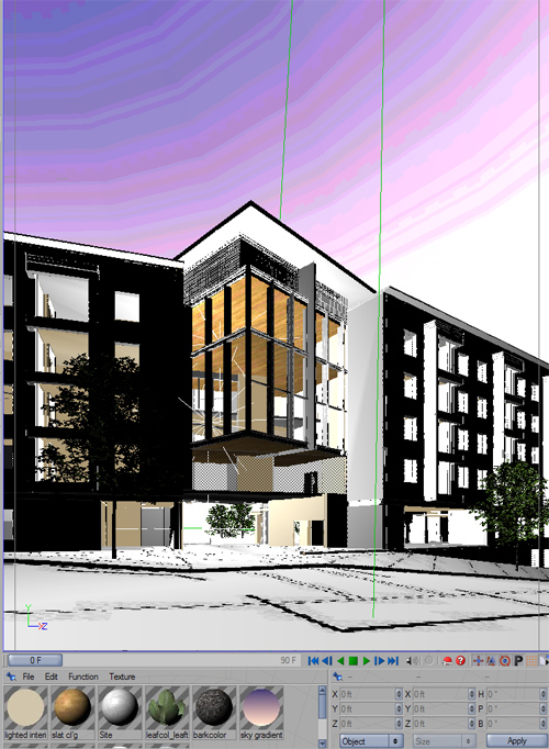
But Preston and Paul both thought that the view of the building’s entry area, with an opening at the ground level looking through open space into the distance, really wanted to be taken at night. The interior common spaces and connecting link above the ground level entrance are all glass, and there was a desire on their part to illustrate how the space could be a lantern of sorts, and that it might illustrate the nature of that space as a place for students to congregate, pass through, interact, etc. A literal and figural beacon of sorts. I threw some very basic lights into the model. Generally, I don’t bother much with lighting in the C4D model, as I use it as a glorified wire frame. But in this case I wanted some more complexity to the lighting. In a daytime shot, there’s basically the sun, and fill light (bounced from the ground plane or filling in from the sky). At night though, there are as many sources as there are, well, lights. I thought a simple balance was in order. Something simplified and diagrammatic. I didn’t want to chase down every desk lamp in every room. That’s not what this image was about.

Eventually it was time for the pencil to hit the paper. Can only push it off so long. Where many of the sketchier pieces can be executed two a day, these were more like one per day, plus modeling time.
Some details….


You might notice a little color in these. Very little. I’ve done a few of these tinted pencil pieces in the past month or so. My goal in pencil work isn’t so much to try to replicate reality. It’s more about creating an atmosphere, and communicating a sensibility. If adding a little color can further that, then I am all for it. No attempt at realism is intended, however, it’s really just an ethereal color-quality laid in to firm the composition and to unify the two views when presented side by side. The softness of the post-production color (added in Photoshop) is a nod to tinted black-and-white photographs, and acknowledges the futility of the notion that one can “color” a black and white image. You really can’t. You need to plan for color in advance and allow it to establish value, not simply hue. But that’s not to say you cannot add some visual interest to a black and white sketch by floating a little color wash over it.
What I like about being able to show these images (much of my other work the past couple months has been confidential) is that many folks, architects included, seem to think that pencil work is necessarily “period” in style. As if it only works with an architecture of an historic sensibility (witness the Yale images and the Otto Eggers pieces elsewhere in this blog). I think these two shots will serve to debunk the thinking that pencil cannot be used to illustrate a more modern architecture, too. It’s my humble (and invested) opinion that a pencil itself doesn’t really know what it is drawing, and that anything beautiful can be rendered beautifully in any medium. I would think you could make something beautiful given a stick and some wet beach sand to scrawl it into, assuming you had a beautiful subject. …and that you knew how to work with a stick and some sand.
