Tag Archives: Modern Theatre

Modern Theatre, Boston; Lobby Interior

Got a call from the architect a couple months ago, Adrian LeBuffe of CBT Architects in Boston, that as a follow-up to the previous three images done for this project, they’d like to go ahead and have a rendering done of the Lobby. This one was going to be a little more dialed back than the others, less theatrical and dark, but it still needed to integrate with the suite of images. The idea was to go much lighter here, yet incorporate the looseness and stylized nature of the others.

The Modern Theatre, Lobby Interior, Washington Street Boston

The space has a great winding staircase which travels up and around the volume, crossing in front of the large original entry, which is a large glazed opening that looks out onto Washington Street (behind the viewer in this image).

The walls were intended to hold a number of pieces of art work, potentially a rotating exhibition of student work.  There wasn’t much else to animate the space, and as is often typical, there was a desire to get back and see as much of the volume as is possible.  Often, this is a nightmare, with extra wide angles distorting everything, and a difficult time wrangling the eye toward a center of interest.

The fact that the stair wound itself all around the space was a godsend in this regard, because it allowed the edges of the image to develop a sort of circular composition, the eye crawling up the stairs from the bottom landing, across toward the viewer’s station point, and upward at left to the balcony beyond, returning to the right and down. In order to anchor the composition, I placed a colorful piece of artwork and the figure of a woman together on the low landing, and balanced those with the largest piece of art on the adjacent left wall. The thinking was that these three elements would work together to form a center of gravity at one of the third points.  They act not so much as an obvious center of interest in the classical sense, but more of an achor, around which the eye can move.

The Large Piece of Artwork (a detail from the Building's Exterior) Works with the Colored Artwork (a detail from the Paramount) and the Figure of the Woman to form the Center of Gravity for the entire Composition.

The neutral color palette was a head-scratcher, too, frankly.  Not for design’s sake, of course.  A neutral palette for the walls supports the artwork, and is entirely reasonable.  I was thinking purely with regard to the level of energy of the prior three images, where the lighting and color were more vibrant simply because we were dealing with exterior night scenes, and an energetic theater interior.

The fixtures lighting the artwork might have provided an excuse to get playful with lighting, but artwork is generally lit evenly and unobtrusively, not theatrically.  So, aside from some nice shadows from the frames, and highlights (I decided to make the frames nickel-silver in color), I wasn’t going to be able to get too exuberant with the lighting.  I didn’t want to light the space in a way that was counter to communicating the design intent, which is the primary consideration of the image after all.

All the other scenes for this series are taken at night, and despite the fact that our viewer’s back is to the large entry window, I still felt it could be an evening scene. This allowed me to introduce other colors not a part of the finish scheme per se by simply treating the scene outside as a wonderfully, colorfully lit source of colored light and colored specular reflections.  It is a street of great theaters, and nightlife is returning, so the hues here come from lights outside the building, at the sidewalk and from retail buildings adjacent and across the street.  These colors creep into the darker corners of the space as colored fill light (turning boring grey shadows into shadows of color), but they are most noticeable at the metal rail, which reflects the lights and ambient color from the exterior.

The Foreground Rail reflects the Lights and Colors from the Street Outside

A door opening beyond, tucked under the uppermost landing, is the entrance to the new theater space itself.  In a vitrine on its far wall is a section from the original theater’s frieze.  The rest of the existing 19th century house was beyond salvage, but a portion of its cherubic frieze, about four feet tall and nine feet long, will provide some color and visual interest to the theater vestibule.

Detail showing the Entrance to the Theater at Ground Level, with some artwork on the volume at right, which houses the building's elevator.

In order to break up the long unrelenting (compositionally, anyway) handrail, I introduced the figure of a woman at the rail, hit from above by a downlight.  She not only breaks the rail, but somewhat obviously redirects us back into the image and reinforces the circular composition. The rail behind her continues up and to the right, and the eye renters the loop.

The Figure at Left serves to break the long line of the Winding Rail

The rewarding thing to me about this series is that the Architect and his Client (Suffolk University) recognized that the very nature of the Theater as a project type, and the fact that the project would provide some much-needed (and long missing) activity and visual interest to this portion of Washington Street, meant that we could be a little more experimental.  The exterior images set a tone and a stylistic approach, and the challenge then became to maintain that theme throughout the series, as the two interior pieces were introduced at later dates.

1 Comment

Filed under Commissioned Work

The Modern Theatre, Boston: Exterior

…waiting on a package of drawings for a set of three images that I’ll need to execute by end of the day Thursday.  As I sit here with an eye on the in-box, I might as well make use of my time and expand upon some work I showed a couple months ago. Then, I posted an interior shot of this historic theater’s renovation, and so now maybe it is about time to post the exteriors.

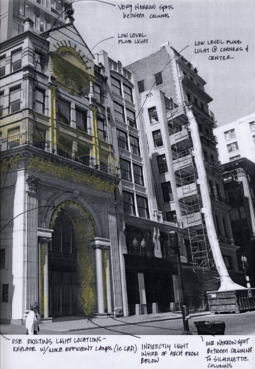
The existing building is a somewhat odd mixture of a classical entry of an arch and columns, coupled with a later addition (of a few upper floors) in an incongruous polychromed victorian “mannerist” confusion.  Taken in parts, each is perfectly fine, but together it seems, to me, there’s little hierarchy.  Makes for a difficult composition. Because it was an existing building, I basically got a marked up existing photograph from the architect, showing some thoughts about exterior lighting.

The Existing Theater, with architect's comments

The Existing Theater, with architect's comments

The new work is a tower above, housing students of Suffolk University.  The tower, as large as it is, is secondary, and not intended to (literally or figurally) overshadow the theater entrance. When renovated, the theater will host live performances, and the dormitory tower won’t really be a part of that experience.  In some ways, as far as this pair of exterior images is concerned, the tower is to be incidental, and background.

The architect had modeled the tower, and provided me with a shot of it from roughly the same angle as the existing photographs.  The difficult thing for me is that the tower and the existing building are not structurally parallel or aligned.  They are just a bit off, which makes them (in a rendering) appear to have “perspective issues”.  That is, it looks like things are out of whack in three dimensions.  Another complication is that the corner of the existing building, where it returns down the alley at left, is not a square ninety-degree corner.  It is wider, and flatter, and so it also appears out of whack in perspective and not parallel to the tower.  Can’t be avoided, really.  It’s the kind of stuff you don’t pay any attention to walking down the street, but which jumps out when you study it in 2D.  The choice for me is often whether to render it faithfully (out of whack) or to tidy it up and force it back into a more expected alignment or geometry.  In this case, because the tower and the existing building were already at odds, I felt that trying to “fix” everything would be too much manipulation.  One tweak or two is acceptable, but a few “white lies” can really pile up and cause problems. So the odd geometries were allowed to coexist.

The client wanted to show the theater at night. It had been empty and run down for about 20 years, and was a veritable “missing tooth” in Washington Street’s row of wonderfully lit theaters.  Restoring it would contribute greatly to the night time street experience.

rendering.pdf

The Modern Theatre, Boston

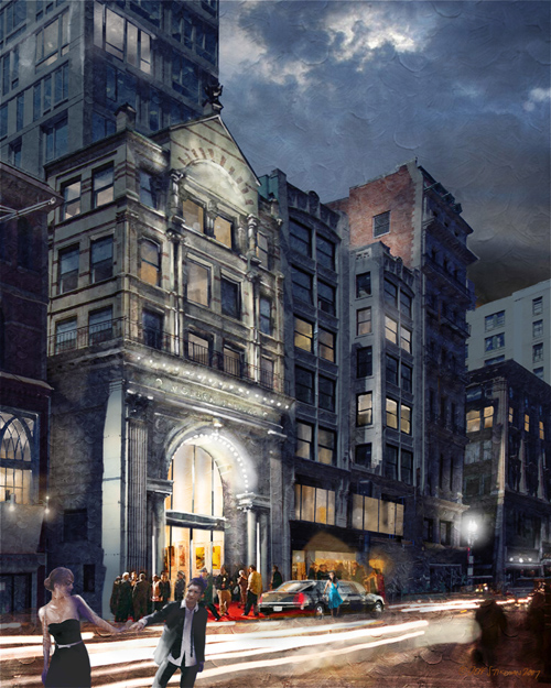
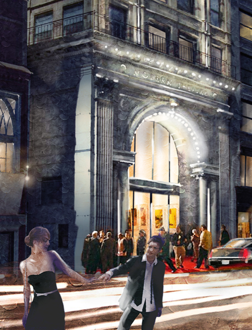
I mentioned in a previous post about the interior image that the project architect for CBT, Adrian LeBuffe, was amenable to doing something a little more visually interesting than a standard glory-shot. Because it was a theater, the idea soon became to inject a little, well, theater or drama into it.  The idea is that people are arriving for an opening, limos, bright lights, traffic, etc.  and that there’s a little drama at low left occurring with a couple who are either on their way there, or headed home.  Not quite sure what’s happening, as much as I was trying to set something up and let people fill it in with their own thoughts.  It was a bit of an attempt at a set-piece, with the newly renovated theater acting as the stage itself.

Detail at foreground and Theater Entry

Detail at foreground and Theater Entry

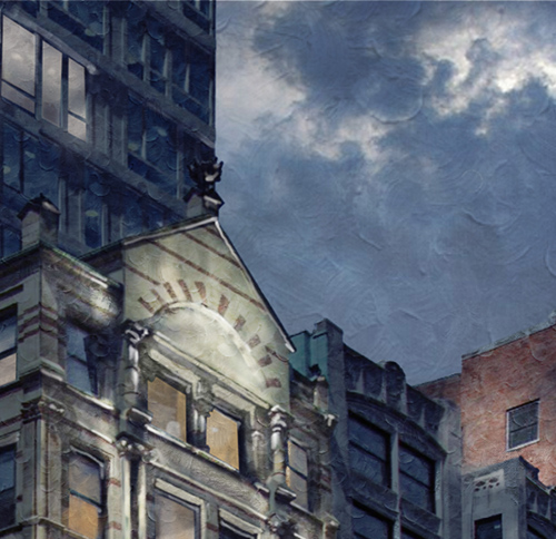
Detail at the upper portion of the existing building

Detail at the upper portion of the existing building

About three months later, the client called to have me do something from the reverse angle, showing Washington Street at night with “The Modern” included as one among a few great old theaters lit brilliantly and creating a great evening street scape.  The balance was to compose the image so that the theater could be included as a supporting player to the street scene, while also trying to make it something of the center of interest.  Those concepts are a bit at odds: focus on it, but without drawing an inordinate amount of  attention to it.

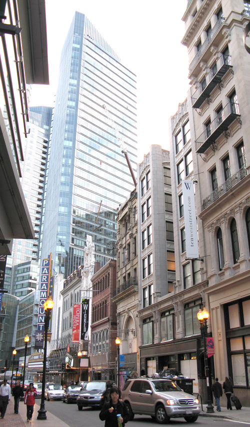
There was an existing photo to work from, and the architect had spent some major effort in generating a photoreal daytime view. This image (below) was part of that work, which I further stripped down back to the barest information.  This image doesn’t represent the fine work of the architect’s team, it’s a rather dumbed-down version that I used as a base to begin my work.

A daytime shot of Washington Street from the Station Point (or viewpoint) selected by the client.

A daytime shot of Washington Street from the Station Point (or viewpoint) selected by the client.

The work I did at this point was essentially an exercise in overpaint.  Mostly, I used a hard round brush in photoshop to build up the image, and drew in whatever was missing. I also edited out those things which were a distraction.  A giant Mercedes SUV may be a handsome car, but there’s no reason to keep it front and center in a rendering, fighting for your interest. Lose it.

I also continued the use a textured “ground” under the image, to break up edges and add a unifying visual interest to the surface.  I suppressed the amount of strokes that are visible where there is detail or a center of interest, and allow it to be pretty strong and obliterating where there is a desire to keep the eye from lingering.

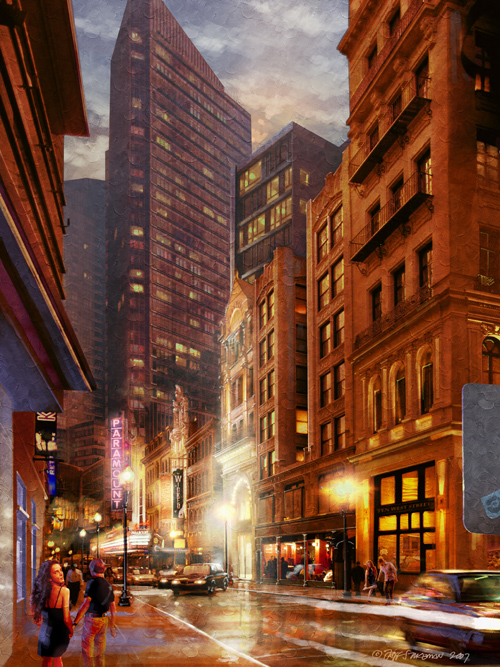
Washington Street, and The Modern Theatre, Boston

Washington Street, and The Modern Theatre, Boston

Compositionally, the Millennium Tower (the glass triangular-topped tower, at center left) was asserting itself too much, and so I just clipped the top off.  That relegated it instantly to lesser status.  If it had a completed top, it would have read much more like the center of interest. I also pushed it back with some atmospheric depth.

I frankly feel that having the theater dead-center is a bit of a compositional no-no, but the two buildings at right were added to the “make-sure-you-show” checklist halfway during the work.  Turns out the project would also be renovating the two right buildings, and so the client wanted to show them as well.  That forces things compositionally, but as this is illustration and not fine art, there is an editorial aspect to things.  I don’t just get to paint what I want… I did add the back side of a no-parking sign at far right, in cooler blue, as a bit of relief to the sea of red/orange and to “push” the viewer’s eye back into the composition.  On the back of the sign there’s a little in-joke. I applied a sticker with my website’s logo on it.

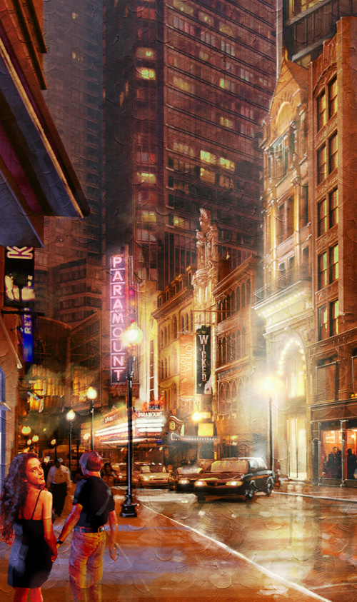
At lower left again is a staged bit of tension.  He’s leading her on, yet she’s looking back at the viewer.  No real story line here, just (in all three views) different glimpses of couples undergoing their own personal dramas.  Some details…

The Modern Theater_FINAL02_detail

Detail of the Theater Marquees along Washington Street

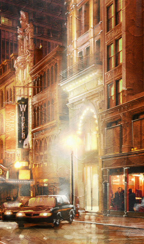
I’m not sure there is a more enjoyable type of architectural scene to work on as an evening exterior of a street of theaters.  For me the real enjoyment came in turning the daytime photos into evening shots, and adding exterior lighting and the highlights they generate.  In this case, adding details is very much like painting in an opaque medium, where strokes of lighter values (like white) can go down over darker values.  In watercolor, that’s not really possible, and if you want something white you generally need to leave the paper showing through from the very beginning.  Watercolor can seem to be a very much a straight-line process, building up darks with little chance to retreat.  Digitally, though, I am able to jump back and forth between darks and lights if need be.  It’s very forgivable having an “undo” button.

Detail at the Entrance of the Modern Theater; showing the overpainted lighting effects and "paint" work

Detail at the Entrance of the Modern Theater; showing the over-painted lighting effects and "paint" work

From what I understand, the Modern Theatre should be opening late 2009.

3 Comments

Filed under Commissioned Work

The Modern Theatre, Boston; Theater Interior

Busy week.  Wrapped up yet another sketch  for a University project Monday/Tuesday, did three images today for a project at Boston College, and I’m headed to Martha’s Vineyard tomorrow to scout a property for a large format formal watercolor.  Before I leave, thought I’d update the blog with a project from about a year ago.  There are three images in this series, but I think for now it’ll do to just deal with the interior.

Proposed Theater Interior for The Modern Theater, Boston - CBT Architects

Proposed Theater Interior for The Modern Theater, Boston - CBT Architects

The Modern Theatre opened in 1914, and was the first theater in the country with a dedicated sound system for projecting talkies.  It’s also the home of the “Double Feature”.  After years of lying empty and unused, it’s now being renovated by Suffolk University, which owns the building.  A tower is being constructed on site to house 200 students of the university, and the original exterior is being restored.  Over the years, the interior has suffered many indignities, and there is nothing remaining that is salvageable.  In the gutted volume,  a new 185 seat theater is being built, and the lobby will double as a gallery for local artists.

Since the interior was to be all new, there were no photographs to work from. Essentially the only information was a conceptual plan provided by the architect (a preliminary study), and a couple paragraphs describing the lighting system.  It’s a fairly common scenario:  do a concept rendering of a space before it is finished, so that if it isn’t feasible, the client won’t have spent a lot of money developing the idea.  Only problem is there’s not much to work from in order to do the rendering itself.

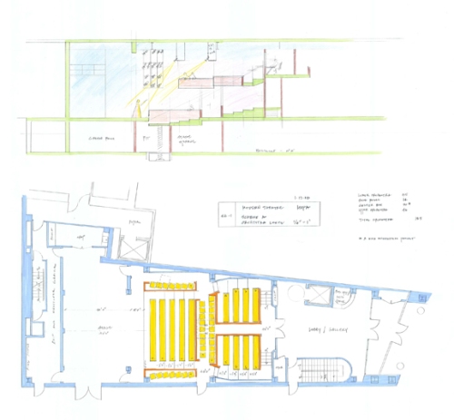
Here’s a plan (at bottom) and a longitudinal section (top).  Martin Vinik was the theater planner.  The architect for the entire project was CBT Childs Bertman Tseckares Inc, of Boston.

Section (at top) and the Conceptual Plan

Section (at top) and the Conceptual Plan

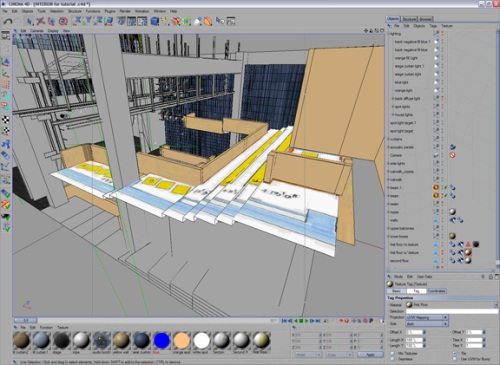
I made a quick model using the plan as a texture on the floor, so that I could build the elements to scale without much fuss or thought.  No need to build anything that won’t be seen from the stage (which is where I wanted to take the view from), and no need at all to build the rest of the building.  Nothing but the volume of the theater and the balconies, stage, light rigs and catwalks.

The Model roughed out in Cinema 4D

The Model roughed out in Cinema 4D

My gut feeling in this case was to try to avoid the idea that a theater view must always show the point of view as if it is taken from the house.  You’ll often see a rendering of a new theater taken from the farthest seat in the house, with a very wide angle lens, in an effort to show the entire house.  This tends to distort the space and lay it wide open, splayed and out of normal perspective. The near seats look mammoth and the stage looks distant and minuscule.  Not good.

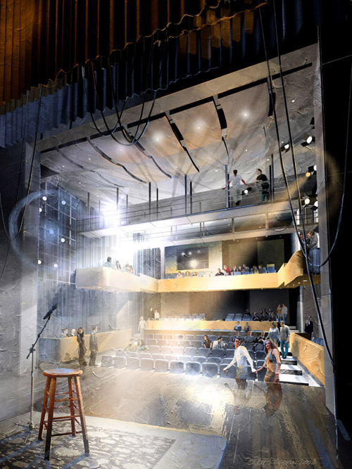
Rather than play that game, I went straight for the stage.  I had the idea that I’d show the house and seats from the performer’s perspective.  Since the performer is visible from every seat, it goes without saying that the performer will be able to see the entire space.  If I showed the crowd filing in prior to the performance, I could even turn up the house lights and manage to show the space in its entirety.  One or two tries with the camera, and I settled on the view to be developed (below).

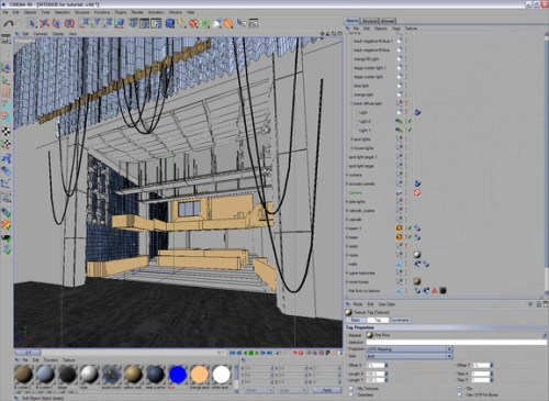
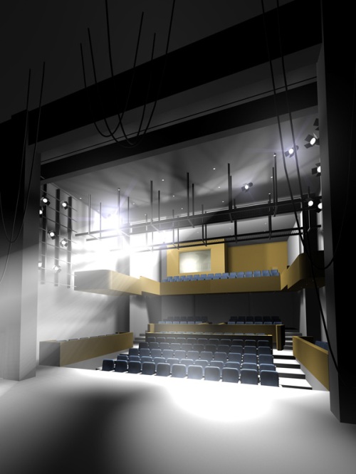
The Model, viewed from the Proposed Camera Location

The Model, viewed from the Proposed Camera Location

I sprinkled in some lights and jacked them up to provide the requisite glare.  Part of the challenge was to yet again show something without showing anything too specific.  Standard marching order.  Glare helped a bit to camouflage some areas and hide them from direct view, because we didn’t quite know what many of the details would be.  Here’s a test render, done with an eye to create some interesting lighting and shadows

A quick Rendering Test of the Model

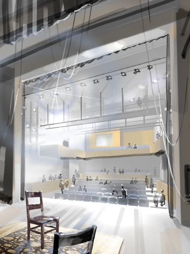
I sketched out a quick composition test to run by the architect.  This was painted directly onto the test rendering, and anything in this image that isn’t in the one above is simply paint. Well, digital paint, anyway.

Rough Thmubnail Study of the Proposed View

Rough Thumbnail Study of the Proposed View

I worked with Adrian LeBuffe as the project architect for CBT, and though I got the thumbs-up to proceed,  he also provided some additional information about a need for acoustic panels, and clarified some points about lighting.  He also gave me leeway to develop the image in a way that was a little more visually interesting than typical digital renderings.

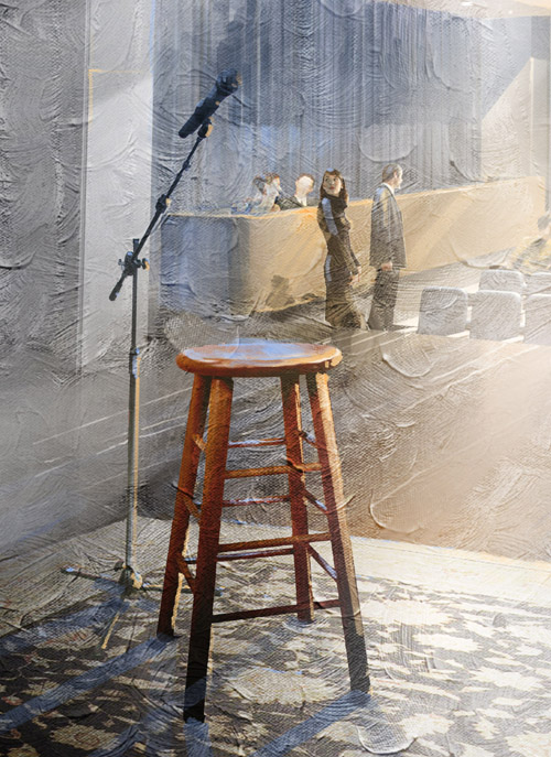
From the composition study, I realized that rather than a vague pair of chairs, the image needed to feel more concretely associated with the unseen performer.  I swapped out the ambiguous pair of chairs for a solo stool and microphone, sitting center stage on simple carpet.  That little tweak made the image, to me, more visceral and a little more believable.

Detail

Detail

Looking at the composition study, you can see that it almost feels as though the stage is in one world, and the house is in another.  The frame of the proscenium and curtains making it feel like we looking through into a television.  I needed a way to bring the two spaces together, making them feel more intimately intertwined.  The visible lighting was a device that accomplished this for me, and allowed me to better organize the composition around competing diagonals.  As for color, the palette is basically all blue/orange.

There is an “ground” or a base texture of varied random strokes, which help break down edges and detail, and help to present the image as more sketchy and less finished.  The texture isn’t there to replicate brush strokes of paint, but is more intended to act like the textured coats of gesso did on raw canvas prior to receiving paint, it provides an interesting surface to work on.

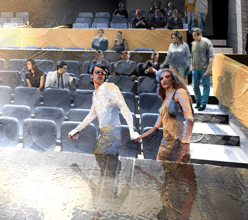
I wanted to continue a motif that I’d started with the two exterior images.  In all three images there are couples who are engaged in their own personal dramas.  In the image below, we have the self-styled urban hipsters headed toward the front row.  In the middle-left is a couple at odds.  He’s checking his watch, and she’s leaning away, feigning interest in something that isn’t even there.

Detail, Entourage

Detail, Entourage

Some other similar minor moves are sprinkled around the image, but all are far enough away to not take away from the stool at foreground left, which was my supporting player in the composition.  The star is the theater space itself.

The Modern Theater, Interior; Final Version

The Modern Theater, Interior; Final Version

8 Comments

Filed under Commissioned Work