Tag Archives: digital

Refurbishing a Boston Landmark

Very quick sketch here from a few photographs of an existing building, the old Filene’s Department Store, by Daniel Burnham, 1912.
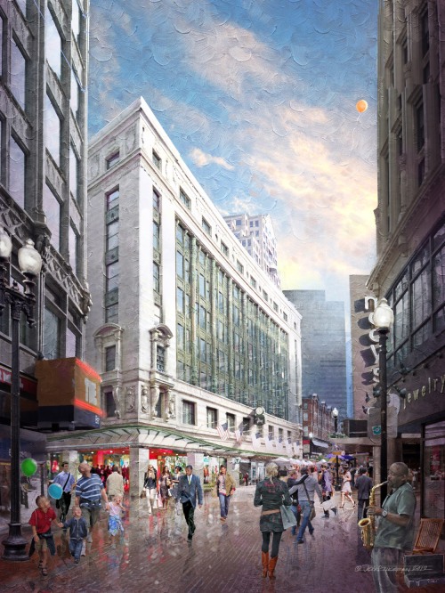
digital photoshop sketch  of Filene's Boston by Jeff Stikeman Architectural Art

Filene’s Boston, 1912, by Daniel H. Burnham Architect, of Chicago. An Idealized Sketch of the Building Following a Proposed Future Refurbishment (click for a larger version)

Downtown Crossing, Boston, is a hot topic at the moment, and most of the discussion revolves around the proposed development of the Filene’s Site, of which this building is a part.  I worked on the Filene’s project/site about fifteen years ago, on the opposite side of the block backing up to the Burnham building. The mid-50s Brutalist Concrete building (since demolished) by Raymond Loewy,  was being considered for expansion and a ‘facade-ectomy’.  Nothing came of it (the project succumbed to the recession of the early ’90s).  That project however also included some measures for restoring the existing Burnham Building, cleaning and stabilizing its granite field, and deep-green glazed terracotta columns. The full restoration did not take place at that time, but there were measures taken to stabilize the terracotta, and replace some that had been lost or excessively damaged.  Those pieces now read in a different shade of green, having weathered the couple decades not as well as the century old glazed terracotta of the original. As part of the comprehensive development of the site (including a high-rise tower), some amount of work will need to be visited upon the flagship building.  Additionally, the window glazing which has been painted out for many years is shown here as reopened, allowing us to see into the building a bit. In this daytime view, we see only a few hints of the light fixtures at the ceiling level, but there would be a visual connection between inside and out. In the evening, the interior would be illuminated and warm, rather than blank and dark as is has been for decades.

Enlarged Detail of a proposed Corner Retail Entry and Glass Canopy, for the Original Filene’s Building at Downtown Crossing.

This image is only one concept, and will certainly be supplanted by further studies to be sure.  But in this exercise, the charge was to show the building facade refreshed, the ground floor as reopened, with a corner retail entry, new glass canopy, an entrance to the T, and perhaps a hint of an office entry mid-block, just past the T entrance. The view is Idealized, too. It’s not entirely possible to see wthis much of it from the location I’ve sketched it from.  But more about experience than specifics. I wanted you to understand the building, the intersection, the crowd, and the experience of stepping from narrow Winter Street into the light and under that great facade.

The crowd at downtown crossing is an interesting mix of office workers, tourists, young students, and residents. They are what give the area its energy.

A Detail showing a proposed entrance to the T (Subway) on Summer Street beyond. The lunchtime crowd depicted here reflects the energy one can expect to find at Downtown Crossing on a typical day.

As with most concepts, none of this is cast in stone.  That’s the challenge with a sketch like this. We need to represent what actually exists, couple it with what might exist, be specific about it without being too specific (because it isn’t resolved yet), and communicate some idea of the nature of the place.  Downtown Crossing is a vitally energetic part of the city, a literal and figurative crossing (hence its name). And for the last hundred years, a grande dame, the Filene’s building, has been holding court.  She’s a little tired after all that time, but with a bit of attention will again be a beautiful backdrop to the hurrying, shopping, ever-changing never-changing crowds below. That was the idea behind this illustration.

I’d posted this detail out of context a while ago. It’s clear now we’re looking at a touristy dad with kids in tow. His daughter has lost a balloon.

…here it is, diagonally across the frame, heading up, and soon to be lost around the corner of the building at right.

A last detail… There’s always the sound of music somewhere at Downtown Crossing. A sax player, drummers, a guitarist…. often overlapping, always echoing as you walk through the narrow streets on the brick paved streets  among the buildings.

I worked from an existing photograph, which is entirely typical when the subject is extant. No sense reinventing the wheel.  The deadline was also about a day of working time, with some good amount of conversation with my client beforehand, and some minor editing after. The work was performed in February of 2012. Joseph Larkin, of Millennium Partners, was the client.

The photograph which was used as a basis for the above work.

1 Comment

Filed under Commissioned Work

New Work: March-June 2012

Well, I thought February was busy….

Haven’t really had any time to update, which is the very thing that will end up killing a blog.  Literally haven’t had a day off since February began.  That’s both good and bad, obviously.  Nature of the business is that you take work as it comes.  I’m looking for a little break during the typical summer slow-down. And I do have a week of planned vacation coming up.  …can’t believe the year is almost half over. But I could use a break.

Again, most of the work has been confidential.  Most projects coming out of a recession are of course start-up.  Not doing many marketing renderings (for finished/built work), instead, it’s mostly concept work, or schematic design level work.

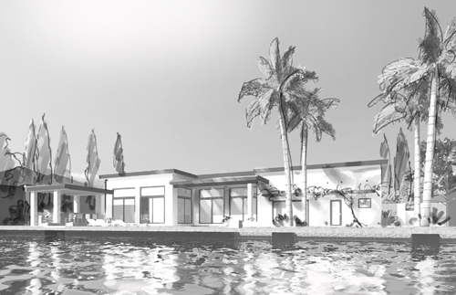
I did execute a couple more formal images for Powers/Schram of Fort Lauderdale, of a mid-century modernist waterfront home.  I worked with Rick Powers a couple times when he was here in Boston as an architect at Tsoi Kobus, and it was nice to reconnect and work with him again.

Street View of “Sunrise Key”, Fort Lauderdale; digital paint with pencil, 11×17

View from the Water of of “Sunrise Key”, Fort Lauderdale; digital paint with pencil, 11×17

Before executing the two images above, we studied a few black and white camera tests.  These two are my favorites from among those we discarded.

Camera Test, for Sunrise Key, Water Side

Camera test, Street Side

I was partial to the lower camera station of the camera test from the water-side, but the intricate and rich landscaping plan begged for a higher camera angle, and it was decided to raise the camera to a point where the pool and landscape could be more clearly seen.

Some details of the final version of the Water Side view, at near-full resolution:

And details of the Street View:

As has become a recurring refrain here, most of the work I’ve done the past few months is confidential.  Following, though, are some details from work which I’m allowed to share, though many are necessarily cropped to remove any telling information.

11×17 Pencil Rendering

Detail of same

…a portion from a very quick, chalky/gouachy little sketch, about 11×17

A detail from the same sketch

A detail from a 9×14 pencil sketch, flicked with digital hi-lites and paint, on brown kraft-paper.

…another chunk from the same sketch, a private home, in Newport Rhode Island

A tightly cropped detail from a very quick, very loose digital sketch, for a proposed roof deck bar. This detail only about 2×2 from an 11×19 sketch

A detail from the second sketch in this pair of fairly loose, sketchy digital pieces.

In looking back at these, it strikes me that each image is entirely different than the next.  Rather than all pencil, or all digital, there is (I think) a healthy mix of differing approaches to the issue at hand.  Rather than reflecting what works for me, I think it better illustrates that my work is about answering the client’s need.  What do you need, when do you need it, and what do you have for me to work from?  And most important; who is your audience?  These are the questions which, for me anyway, determine what kind of image we end up with, how long it takes, what the final piece feels like…

I’ll try to be a bit better about timely updates.  With the economy the way it has been, there’s a tendency to keep working, never sure when the shoe might drop.  If the work keeps coming in though, that can make for a long run of heads-down work. All work and no-play, and all that.  We shall see what summer holds.  Since it seems to be when my clients, and their clients, take their vacations, that means it’s generally my vacation too.  Have a good summer yourself.

1 Comment

Filed under Commissioned Work

Charlesview Residences, for The Community Builders

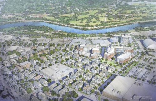
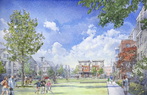
A groundbreaking was held the 16th of May at the site of what will be a new 22-building neighborhood called The Charlesview Residences, comprising 240 mixed-income rental units, 100 home ownership units (affordable and market rate), 14,000 square feet of retail ground floor, community spaces, and parks.

I was commissioned by Jeff Beam, of The Community Builders, to do a small suite of four sketchy renderings in order to provide the press and attendees with an atmospheric impression of the overall project as proposed.

Charlesview at Brighton Mills, Allston-Brighton

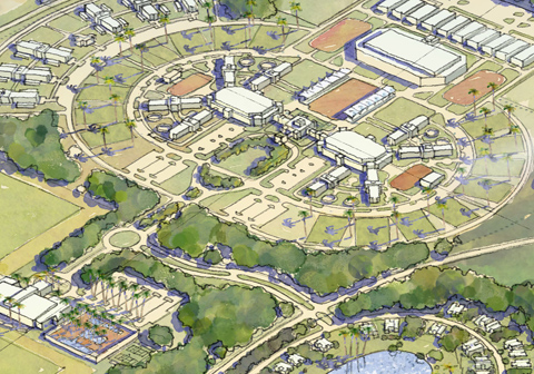
An Aerial View of the Project, middle ground. Digital, 11x17 and 300dpi

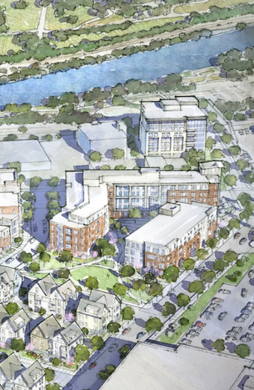
Aerial Detail of Charlesview

A detail from the Aerial, about twice full-size

Another Detail of the Aerial Sketch, zoomed in to about three times full size

The project had been in development by the non-profit development corporation The Community Builders for the past eight years or so, with CBT/Childs Bertman Tseckares Inc., of Boston, as the architect.

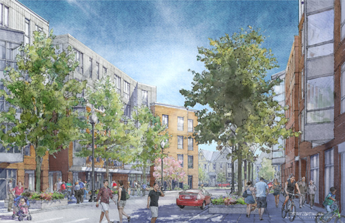
A view South Down Antwerp Street

The View South Down Antwerp Street; digital 11x17, 300dpi

Detail, at about Full Size, showing a portion of the Josephine Fiorentino Community Center, on the Eastern Side of Antwerp Street

Detail from Center, with a small hint of the Home Owenership Housing and the Park, Beyond

Sidewalk, West side of Antwerp Street

This substantial development will include the relocation of residents from the original Charlesview residential complex, built over 40 years ago on a five acre parcel just a few blocks away up Western Avenue.  Harvard University is providing the parcel for this project, almost twice the land area of the existing complex, in exchange for the smaller parcel where the original complex is currently located.  Harvard will also be providing a substantial  payment to cover the relocation costs of the residents, who are represented by the neighborhood organization Charlesview Inc.

Park at Antwerp Street, Charlesview at Brighton Mills, Residences

A half-acre Park will be created on Antwerp Street, between the taller Multi-Family Residences along Western Avenue and the smaller-scaled Ownership Housing to the South

A Detail of the Park Sketch, with a portion of a Community Center, beyond

Along the Park, a mix of Black-eyed Susans, flowering trees, and a large specimen Copper Beech

The project is expected to create more than 600 union construction jobs, and is partially financed by the AFL-CIO Housing Investment Trust, along with financing by MassHousing, private debt, and tax credits.

View across Telford Street, at the intersection of Western Avenue, looking west.

Enlarged Detail of same

To visit the Project Page on The Community Builder’s Website, click here: >> The Charlesview Residences

_______________________

© Jeff Stikeman and jeff stikeman architectural art, 2009-2010. Unauthorized use and/or duplication of this material without express and written permission from this blog’s author and/or owner is strictly prohibited. Excerpts and links may be used, provided that full and clear credit is given to Jeff Stikeman and jeff stikeman architectural art with appropriate and specific direction to the original content.
7 Comments

Filed under Commissioned Work

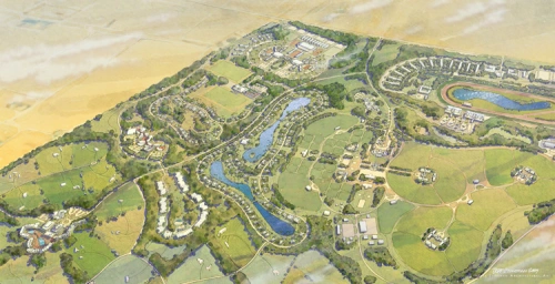
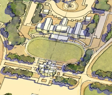
Aerial View, Equestrian Complex Master Plan

Can’t really show the full suite yet, or give out too much info.  Just thought it would be good to finally post something from the past ten days’ effort.  I was out of radar range the whole time, and am glad to be able to post something again. This is one of four color pieces (digital) that I did to illustrate a massive development of residences, a hotel, equestrian sports and breeding facilities,and farmland in the middle east.  It’s almost literally an oasis in the desert.

Aerial,  10x19 at 400dpi

Aerial, 10x19 at 400dpi

I may be able to expand upon this a bit more and show some of the eye-level views, but for the time being, I’ll just toss out some detail shots of the aerial.  Again, this is digital.  The client wanted something fairly detailed, but soft and conceptual feeling, almost diagrammatic.

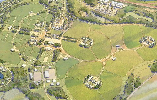
Zooming in, detail at center

Zooming in, detail at center

This detail (above) is about 5 inches by 9.  At 400dpi, the full-sized original would still print at 150 dpi up to 52 inches across.  I don’t normally work at this higher resolution, but the client requested it and the scale of the buildings at my normal working size (11×17) was infinitesimal.

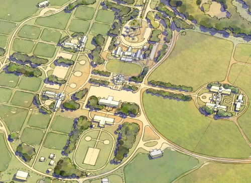
...zooming further

...zooming further

This is a further detail (above) at 2-1/2 inches by 4.    The client wanted enough detail so that they could zoom in on portions of the aerial to illustrate portions of a presentation, with each section of the site having an enlarged portion of the rendering illustrating it.  Here, we are zooming in on the breeding complex.

And just to beat this zooming thing to death (pun intended)…  one last further zoom into this area of the image.

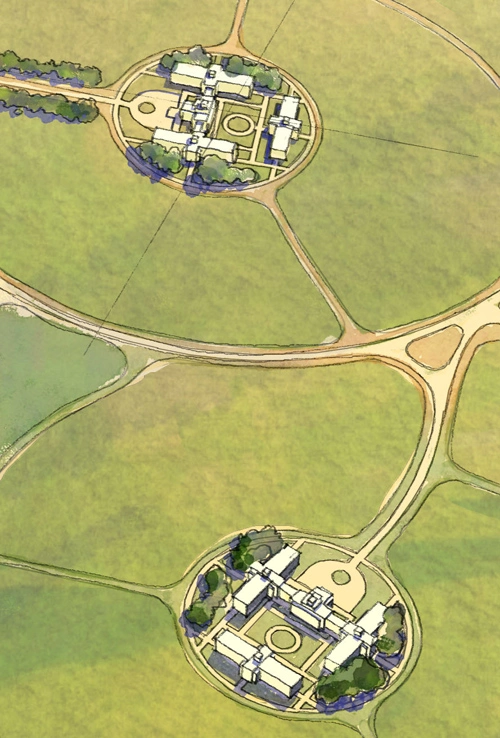
Presentation Ring, Detail at 1 inch x 1.5 inches

Presentation Ring, Detail at 1 inch x 1.5 inches

For reference, the green oval presentation ring in the center is only a half inch wide.  The cruciform building at bottom is less than a quarter of an inch wide (it’s 3/16ths, to be specific).

Ok.  Enough of that.  You get it, the thing is huge.

Following, then, are some other details.  With any luck, I will be able to post the much more sketchy eye-level views at a later date, together with some information about the project.

Detail of the Equestrian Center, at 2 inches x 3 inches

Detail of the Equestrian Center, at 2 inches x 3 inches

There are (above) three indoor presentation rings, practice fields, polo fields, and stables ringing the complex.

Mare and Foal stables and Paddocks

Mare and Foal stables and Paddocks

the Mare and Foal stables are ringed by semi-circular grass paddocks, for each of the Mare and foal pairs.  My goal was to show a range of yellowish greens unifying the individual paddocks, allowing them to read as a small piece of a larger whole.  You can see patterns in the grass leaping across the small dirt paths which exist in between each paddock.  From the air, it serves to unify the grass areas and the entire group of paddocks reads as a unit.

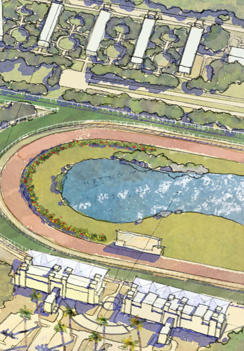
…and lastly, a detail at the race track.  The main building here, with the cantilevered canopy,  is a half inch wide.

Detail at the Grandstand, 1 inch x 2 inches

Detail at the Grandstand, 1 inch x 2 inches

I’ve had some email back and forth with a few folks interested in the manner of achieving the broken down, wet-edge, painterly brushwork.  At some point I think a small tutorial will come about, but frankly it’s nothing new.  I’m using photoshop to paint in color, and building it up as you would similarly with any other traditional paint or pencil approach.

My intent isn’t to go about trying to replicate watercolor, but to produce an equally forgiving, softer, broken down image in a medium that maintains ultimate flexibility to the very end of the process.  An example of the flexibility is  in this last detail:  the outer dark green turf track was originally painted in as reddish earth (dirt).  It’s color was changed in about three seconds, something I wouldn’t have been able to do in watercolor as quickly.  In fact, in watercolor I’d likely scan the original watercolor and make the edit digitally anyway.

A second edit was the white rail ringing the outer track.  I think the white linework and shadow took about five minutes.  A short section of the straight white rail was drawn in on a separate layer, covering about half the length of one side.  I copied that section, making it a full side.  Then I copied that full side, made it a purpley-blue (shadow color),  and deformed the copy so that it laid down like shadow.  Copying the shadow and the associated rail four times allowed me to ring the track (straight sides, anyway) with rail and shadow, and all that was left was to quickly paint in the curved rail sections.  That flexibility and production-oriented speed is what eventually dragged me kicking and screaming into doing 100% of the color work in Photoshop.  I love the smell of wet Arches watercolor paper, and the feel and smell of the watercolor pigments, but at the end of 120 hours’ worth of work, with the printer screaming for a file (four images due at 4:30), sometimes you just gotta ride the digital horse for all it is worth. Photoshop doesn’t replace watercolor, it’s merely a different form of brush.  I’ve had some folks say “oh. so, the work is computer generated?”  Well, no more than a watercolor is “brush generated”.  I still need to make every decision, it’s just I have an undo button, is all.  Photoshop doesn’t make the work easier to conceive.  It doesn’t make someone into an artist, simply by virtue of its potential.   Just as buying a set of the best Russian sable brushes doesn’t make them suddenly able to paint.
2 Comments

Filed under Commissioned Work

Visual Arts Center at Dartmouth College, for Machado & Silvetti Associates

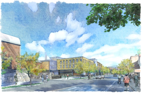
View from the South West

View from the South West

This is one from a pair of images I did for Machado and Silvetti Associates of Boston.  Both were digital pieces, modeled and lit in Cinema 4D, then worked over by hand in Photoshop.

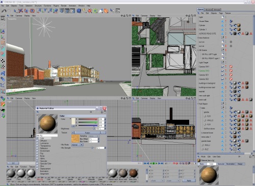
The Model in a Cinema 4D Screenshot

The Model in a Cinema 4D Screenshot

I use the modeling program not only to set up the camera station and determine the view in perspective, but also to light the scene in a way that picks up ambient color and lighting from the materials and atmosphere.  Rather than a flat gray road, I find that the color of the sky and nearby materials will affect the color of the light itself, and thereby modify the final colors of surfaces as the light literally reflects off one surface and then hits and finally “colors” another.  With complex models having many surfaces, lots of glass, and many objects, the process can take a while if not managed correctly.  About a year ago I had a Boxx workstation put together for me specifically in order to maximize speed and render time, and now these solutions which formerly took 8 to 10 hours can be computed in less than an hour at most, often just a few minutes.  This allows for an iterative progress, and numerous trials to achieve light, shade, shadow and color in a palette that works best for the intent.
Cinema 4D permits rendering of the model to a Photoshop-format file, with a number of channels saved as layers or selection masks in addition to the RGB image.  I typically will render the image with some basic colors, even textures, for materials, in order to help bring color into shade and shadows.  But I’ll almost always render it out with additional channels that contain the shadow information alone, major materials, depth information (to later introduce atmospheric perspective with paint), reflections, and even shadows from separate lights.

    The Model Rendered Bare-Bones (top) with Separate Channels for (from top to Bottom) Shadows, Transparency/Glass, and Material Selection (Slate, in this case)

The Model Rendered Bare-Bones (top) with Separate Channels for (from top to Bottom) Shadows, Transparency/Glass, and Material Selection (Slate, in this case)

This allows me to throw a simple brick mock-up texture or surface color on to the model, in order to establish a base color for the ambient light.  The channels will permit me to later go back in to the image in Photoshop and entirely remove the generic material and then re-paint in something more varied and interesting.  This way, shadows can be worked independently of each other in 2D, colors shifted, atmospheric depth painted in, etc.  It takes far less time to paint in a bluish haze than it does to, say, add a physical (modeled) light blue fog to the scene and have it solve for the depth effect by itself.  It’s also entirely independent of the image (on a separate layer), and I can omit the depth if I want at the last minute.  If the haze were part of the physical model solution, it’s in there, and not very “undo-able”.

As a first-pass toward establishing the composition and checking things over with the Architect and their client, I will sketch out a very rough composition test, introducing people, trees, cars, a little roughness and texture where it needs it.  I’ll suppress detail from the model I find extraneous, and which fights the center of interest, while adding in detail where needed by hand.  Colors are tweaked, either cranked up a bit, or dialed back in saturation, shifted one way or another with regard to hue, adjusted for color shifts, etc.  The selection masks made while rendered in Cinema 4D are an immense help in this part of the process.  The composition test is sent off usually via email, and because I’ll invariably have further questions or comments, I’ll include a marked up version of the composition and color test to get the issues out on paper.

Quick Composition Test Sketch with Entourage, and Markups

Quick Composition Test Sketch with Entourage, and Markups

This process of reviews and iterations takes place a few more times, each time dialing in on the final work.  In this case, the class of students sitting around the scene during an outdoor sketch session was ultimately abandoned.  It was also determined that we should see some of the existing Dartmouth Stadium at the far end of the street, to establish the context a bit more concretely.

While working in Photoshop, I take pains to avoid any use of the stock filters.  They are notoriously limited in range, and look nothing like what they purport to be.  The “watercolor” filter looks nothing like watercolor, for example.  Even if it did, the use of such a filter would merely create an image that looks like every other “Photoshop watercolor” out there.  The intent isn’t so much to replicate watercolor, which this doesn’t pretend to do, but to create an image which is expressive, gestural, less-literal and more conceptual, and which clearly shows evidence of a human hand.

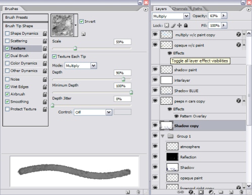
When working in photoshop, I will usually use a simple round brush with a hard edge, pattern stamp brushes, texture overlays, and a system of layer modes that is so interwoven, it can become a house of cards if I’m not careful about it.

Left, a typical Paintbrush; Right, Layers and Layer Effects

Left, a typical Paintbrush; Right, Layers and Layer Effects

Below, the final image, …with details following.

South West View, 13x19, 400dpi

South West View, 13x19, 400dpi

South East View, 13x19, 400dpi

South East View, 13x19, 400dpi

detail01

detail03

9 Comments

Filed under Commissioned Work